Branding
Bringing visual energy and geometric precision to a technical subject — without losing the professionalism the audience expected.
Mid-Atlantic TAB needed a complete conference identity for their annual VA Symposium on brownfields redevelopment — a technically dense subject that doesn’t naturally lend itself to exciting design. The challenge wasn’t just production. It was finding a visual language that could make a serious professional audience feel genuinely engaged.
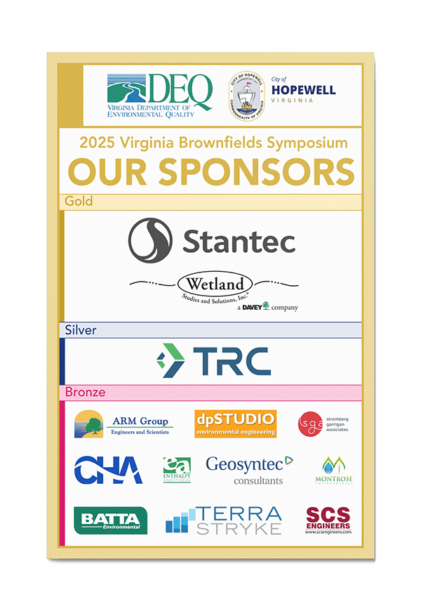
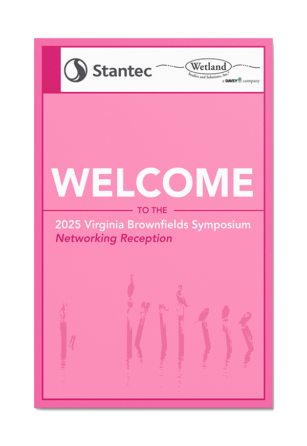
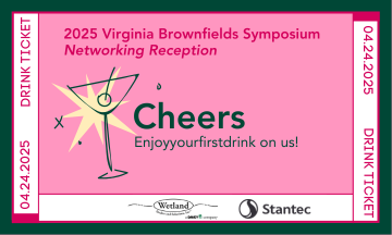
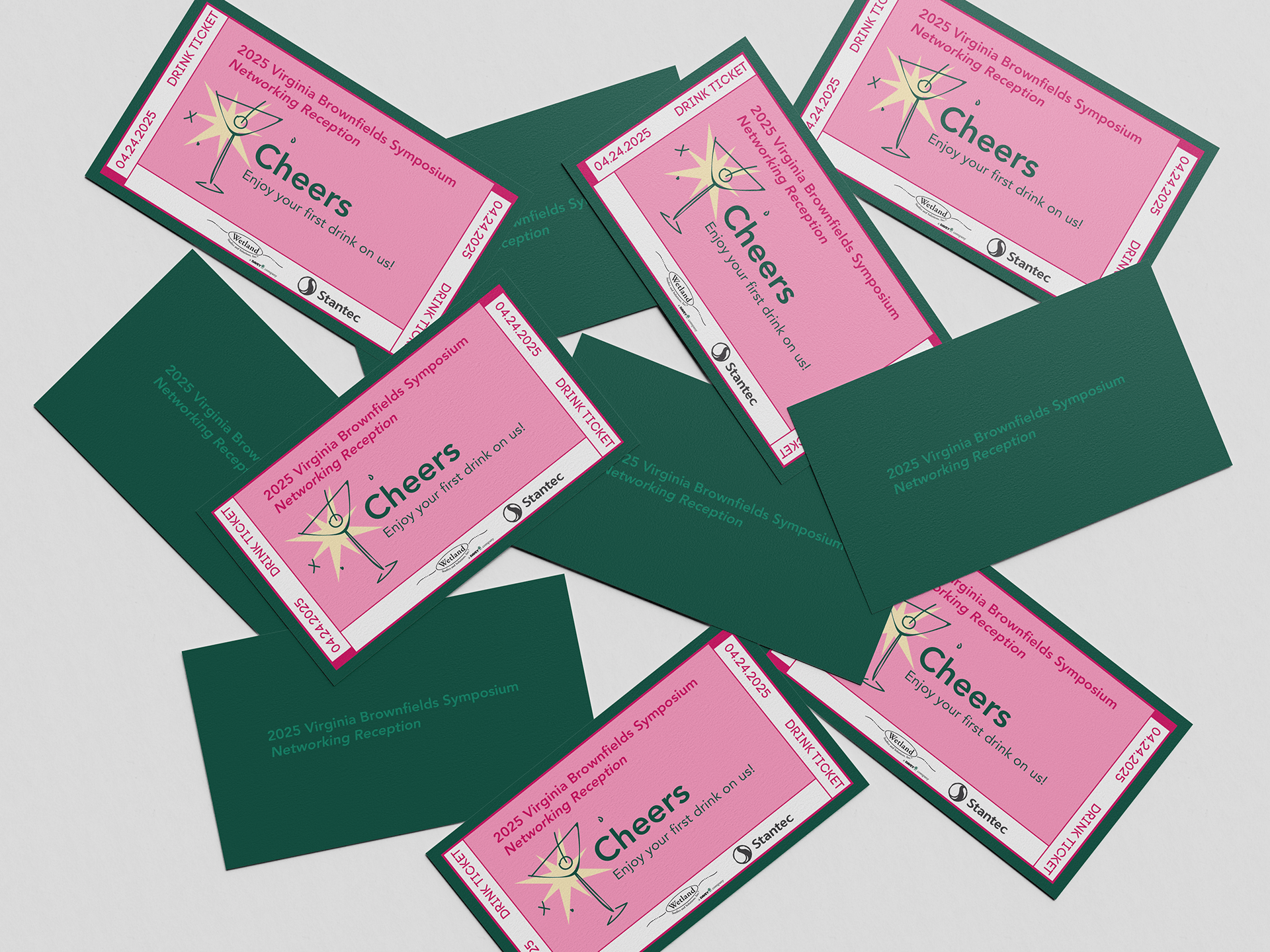
I started with research rather than aesthetics. I pulled color inspiration from previous years’ symposium materials and from the hosting city itself, grounding the palette in context before pushing it further. The result — pink, green, yellow, and blue — was bolder than anything the event had used before, but it wasn’t arbitrary. The geometric, grid-based layouts mirrored the precision and rigor of the subject matter itself. Structure gave the energy somewhere to live.
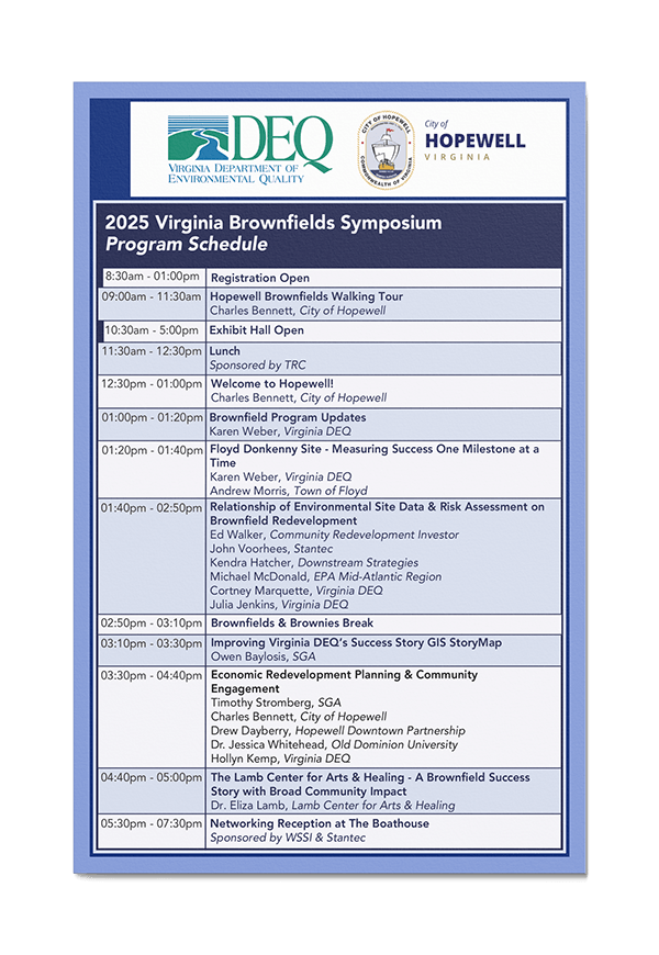
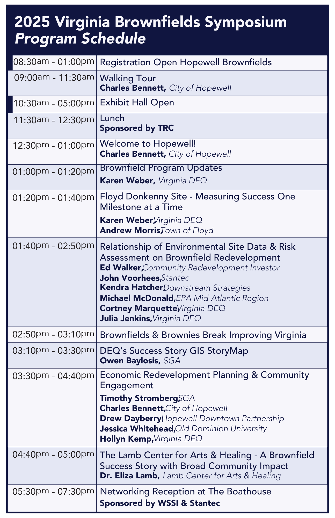
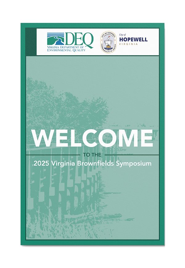
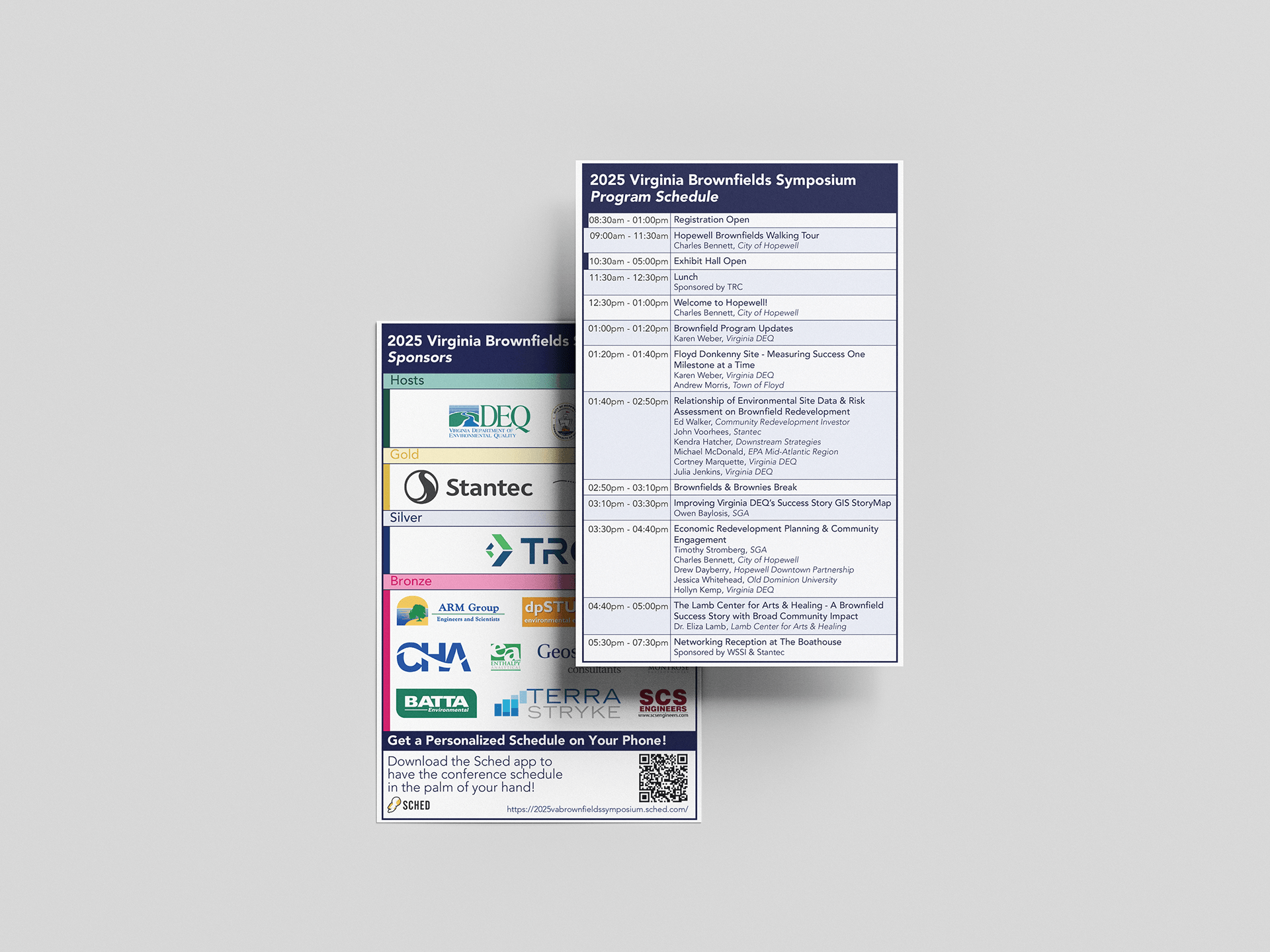
Every deliverable — welcome signage, sponsor pages, schedule grids, registration materials, wayfinding, and drink tickets — was designed as part of a single system. No piece was treated in isolation. The same geometric logic that structured a full-page program layout also showed up on a 3×5 drink ticket. Consistency at every scale is what makes a conference identity feel considered rather than assembled.
The materials were used across the full event and received positive feedback from both the client and attendees. Designing for a technically dry subject with genuine creative conviction — and having it resonate with the audience — is exactly the kind of problem I want to keep solving.