Branding
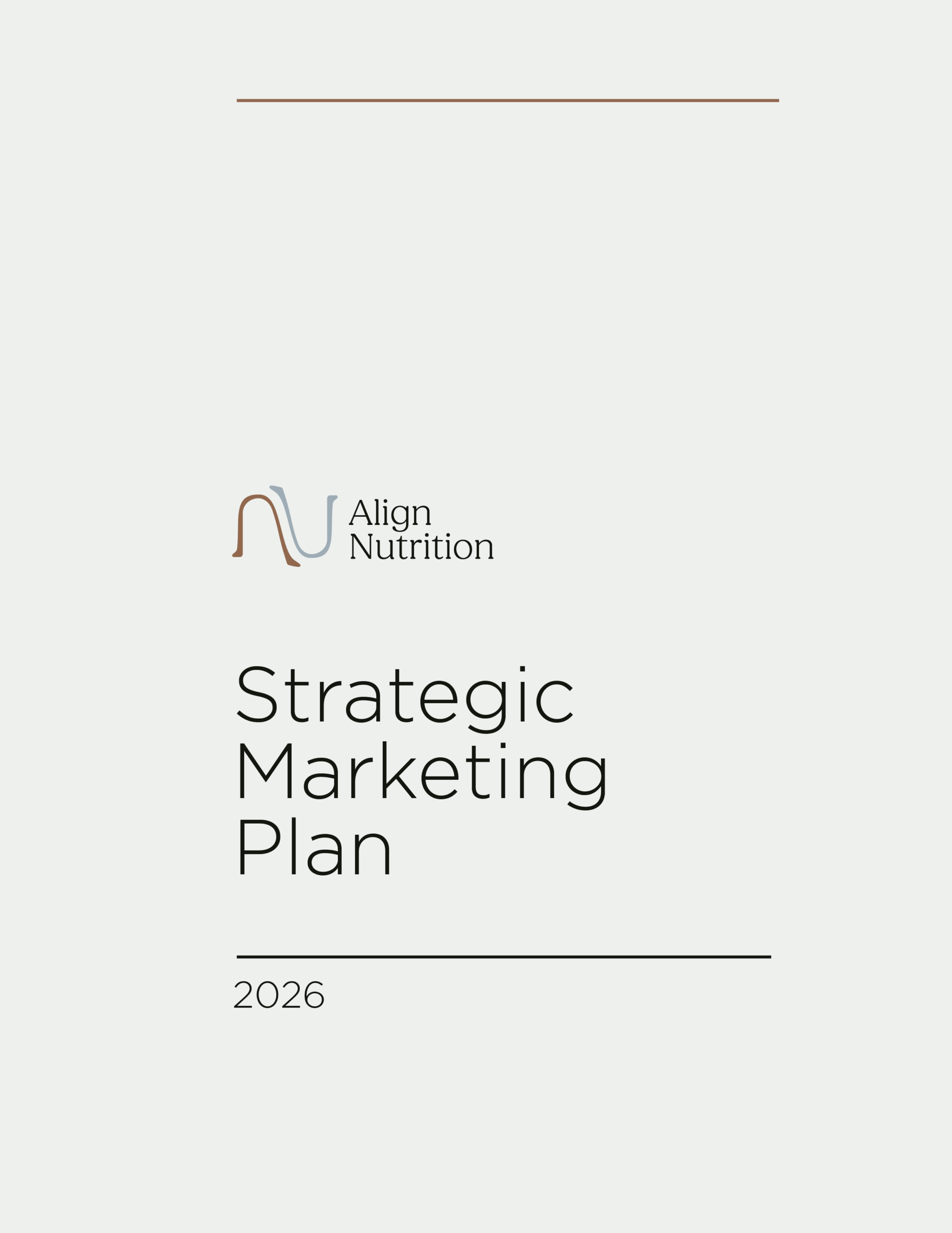
Align Nutrition: Building a Brand
A subscription snack brand built for jaw development.
A subscription snack brand built for jaw development.
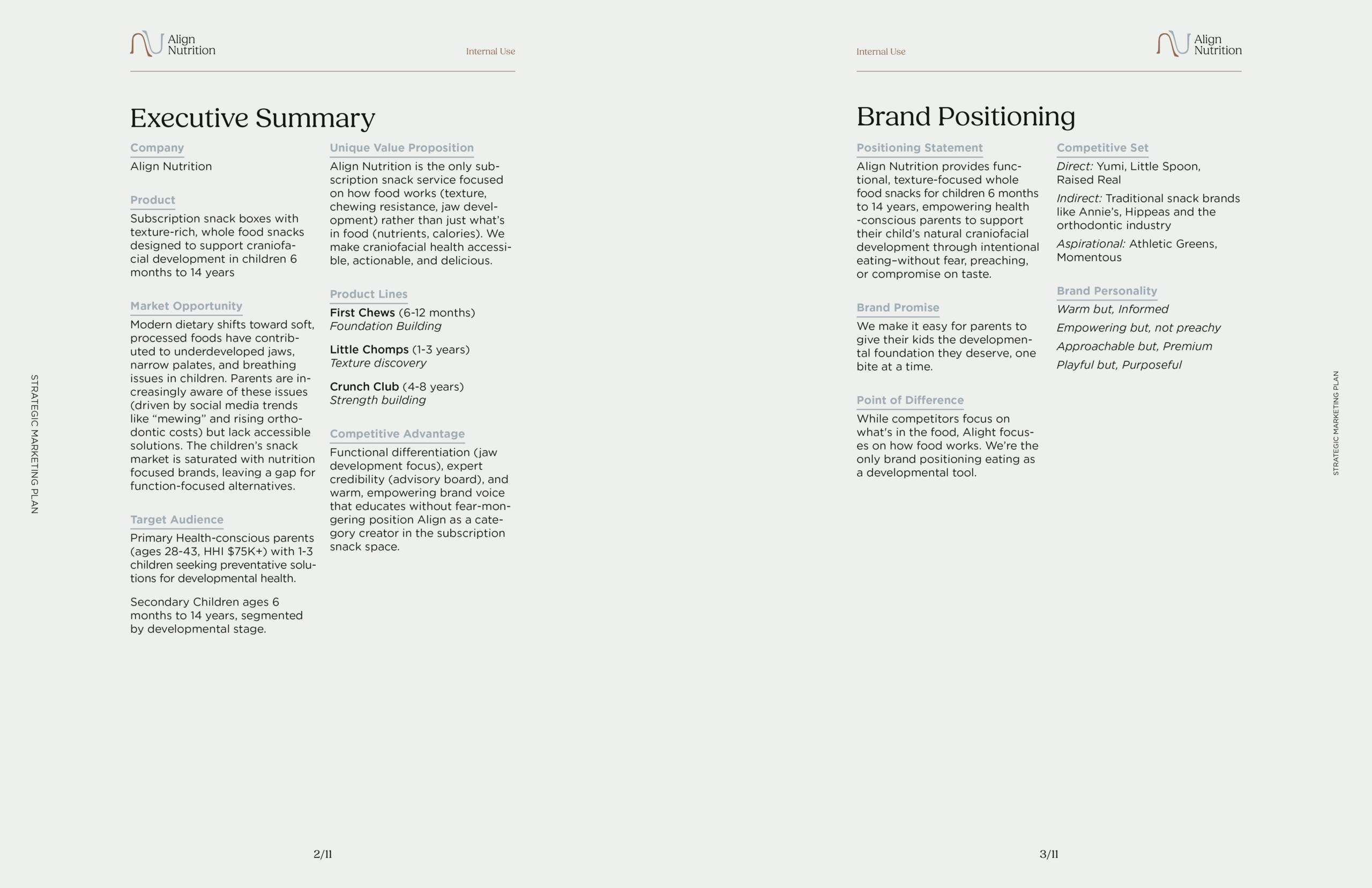
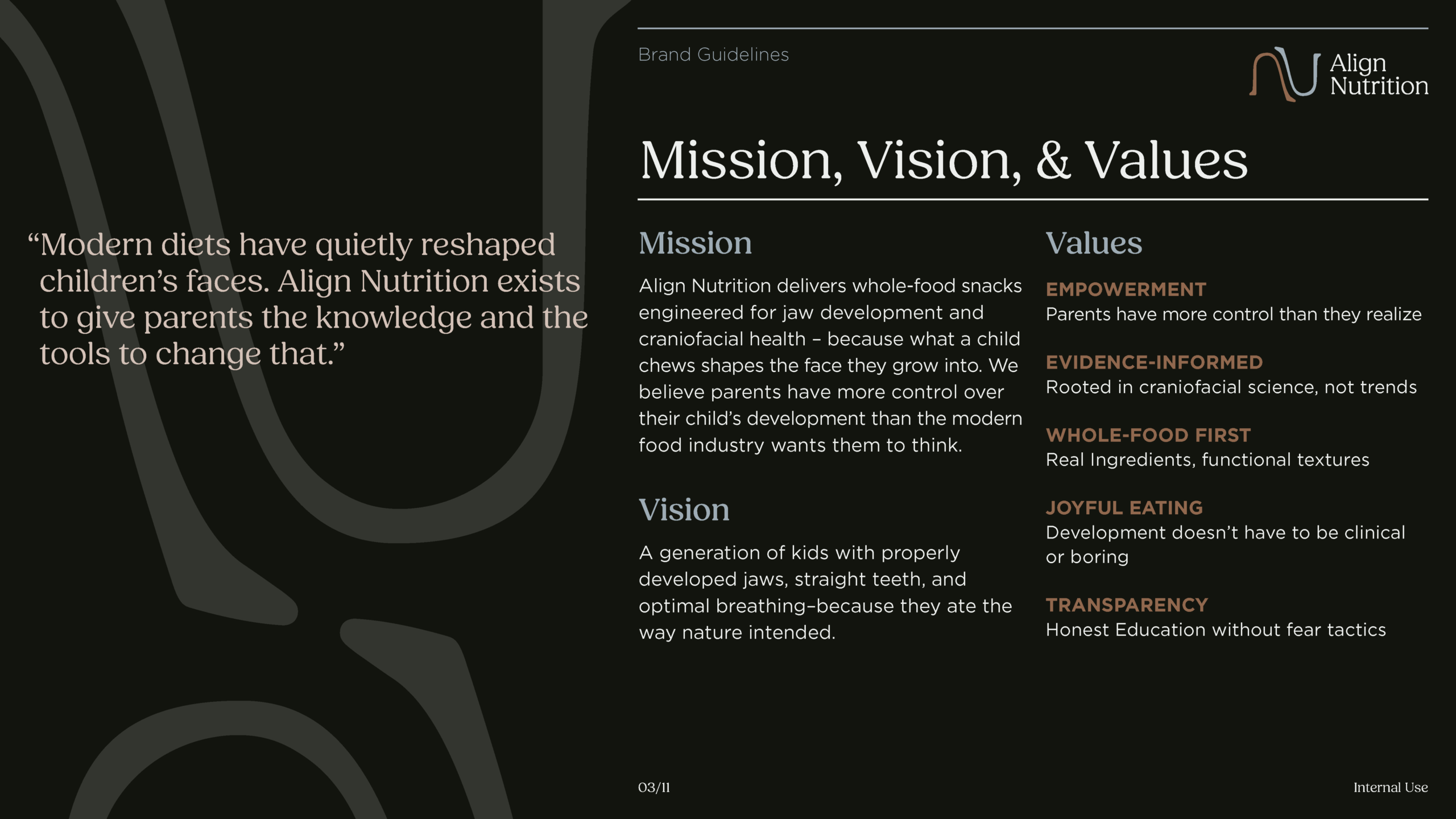
A speculative subscription snack brand designed around a single premise: the texture of what children eat shapes the physical structure of their face. Built as a capstone project at West Virginia University, this brand bridges craniofacial health science and consumer packaged goods: delivering whole food snacks that actively support jaw development across three critical developmental stages.
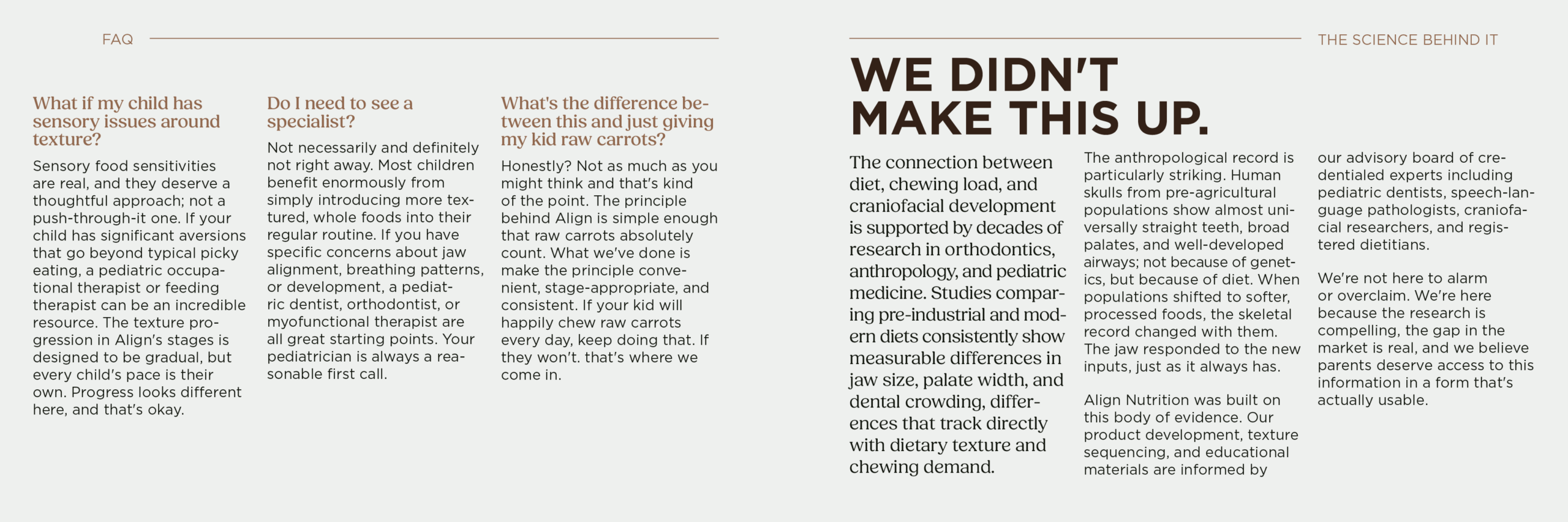
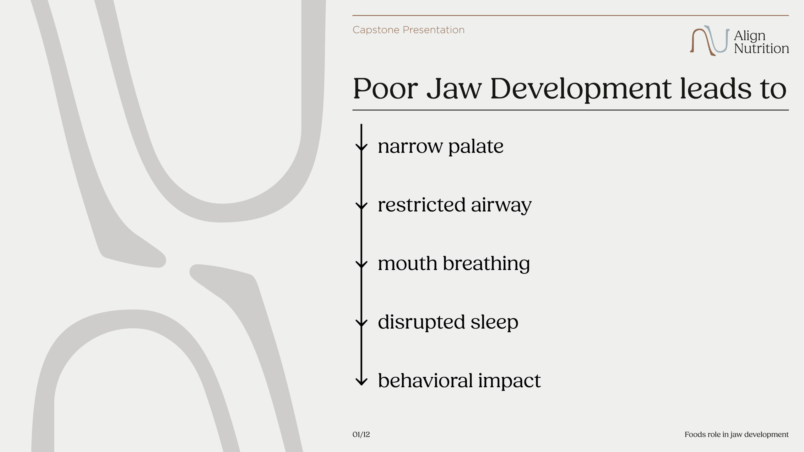
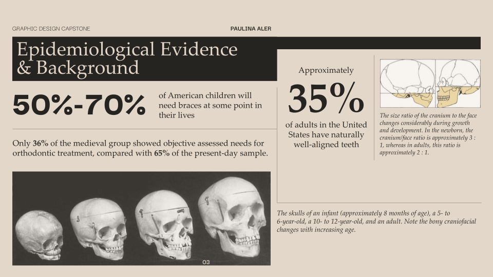
To begin this project, I investigated how modern dietary shifts, particularly reduced food texture and chewing efforts have contributed to increased malocclusion prevalence and associated health consequences. This research examines archaeological, anthropological, and clinical evidence suggesting that craniofacial development is primarily environmentally determined rather than genetically predetermined.
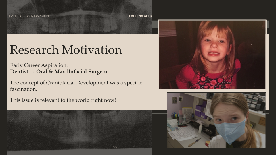
The decision to choose this topic came from a longstanding passion for dentistry. As long as I can remember, I have always dreamed of becoming a dentist. The relationship between science and aesthetic has always been something I am drawn to and I think dentistry was no exception. As I grew up, I preformed independent research on the profession and the wider knowledge base. Through this I learned about oral & maxillofacial surgery and the concepts of craniofacial development. I remember watching a documentary on our shifting diet and how it affected our jaw development. I was maybe 8 or 9 at the time and it really stuck with me as I grew up. Since this project was open topic, I felt that this could be a way to reconnect with that research and better understand what little Paulina was so passionate about.
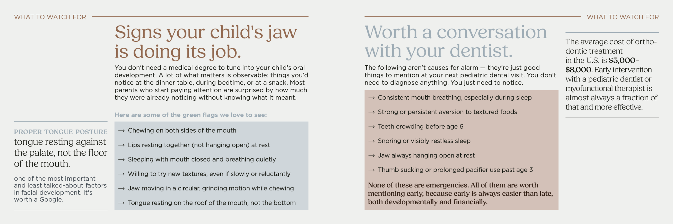
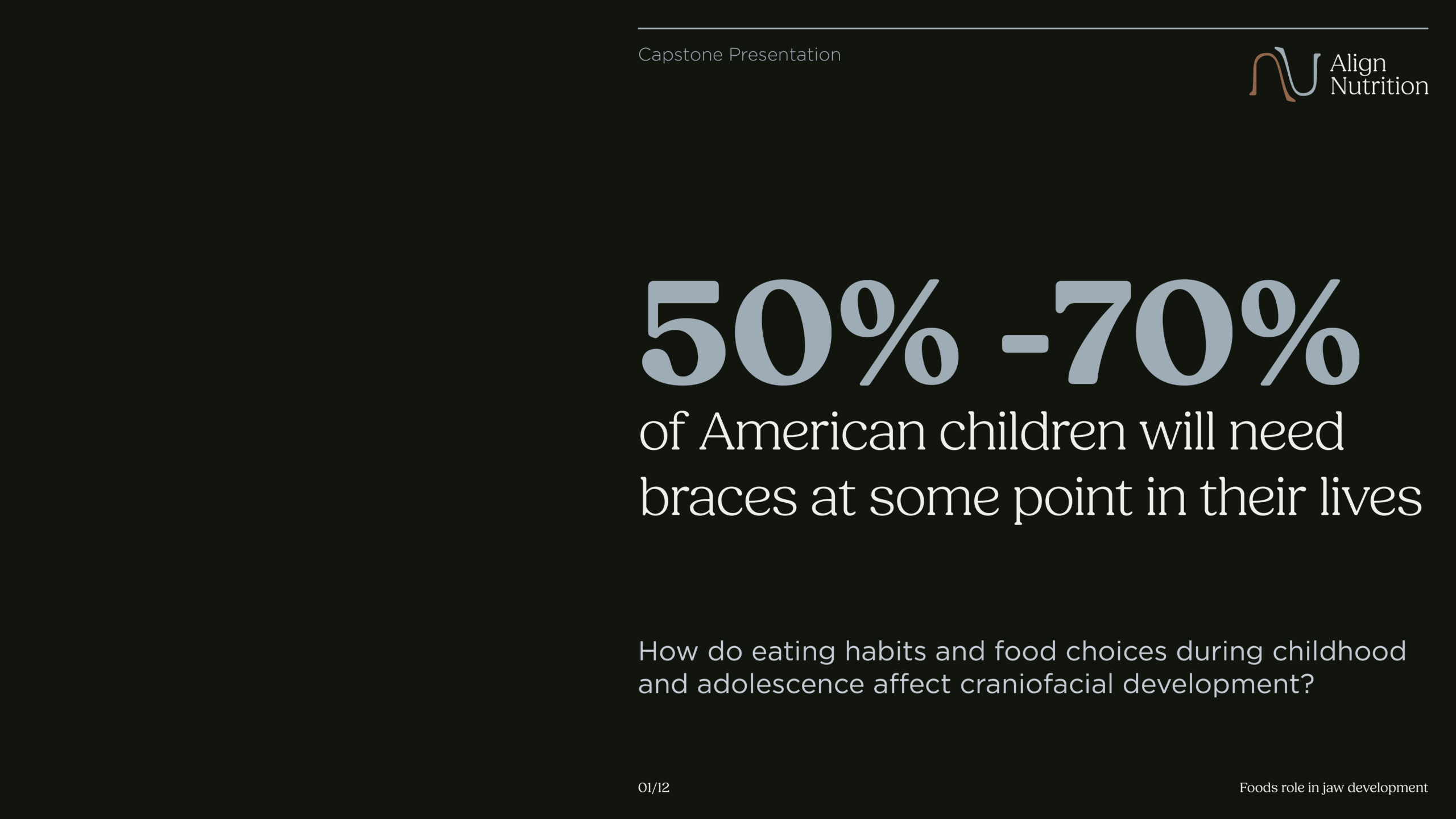
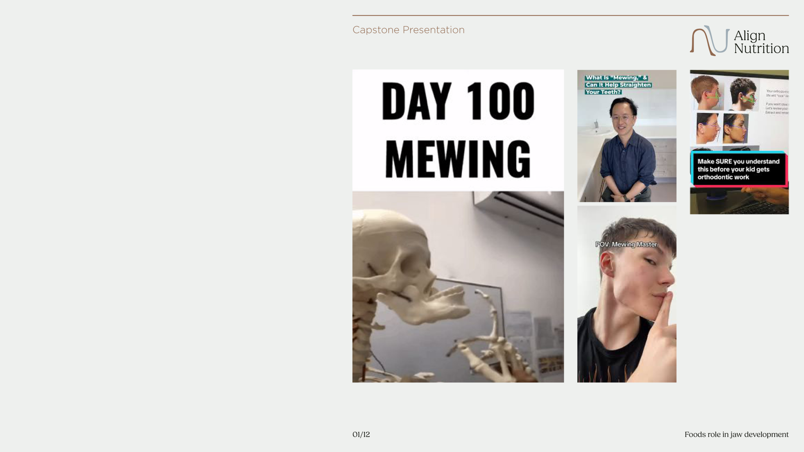
Beyond my personal attachments to this topic, I would argue craniofacial development has been a little more mainstream in media recently specifically with the trend looksmaxing. This trend focuses purely on the aesthetics of a properly development jaw but, there are a lot of health and comfort concerns as well. Particularly crowding of the teeth, malocclusions, and obstructive sleep apnea; that’s a pretty expensive orthodontics bill that could potentially be avoided with early lifestyle shifts.
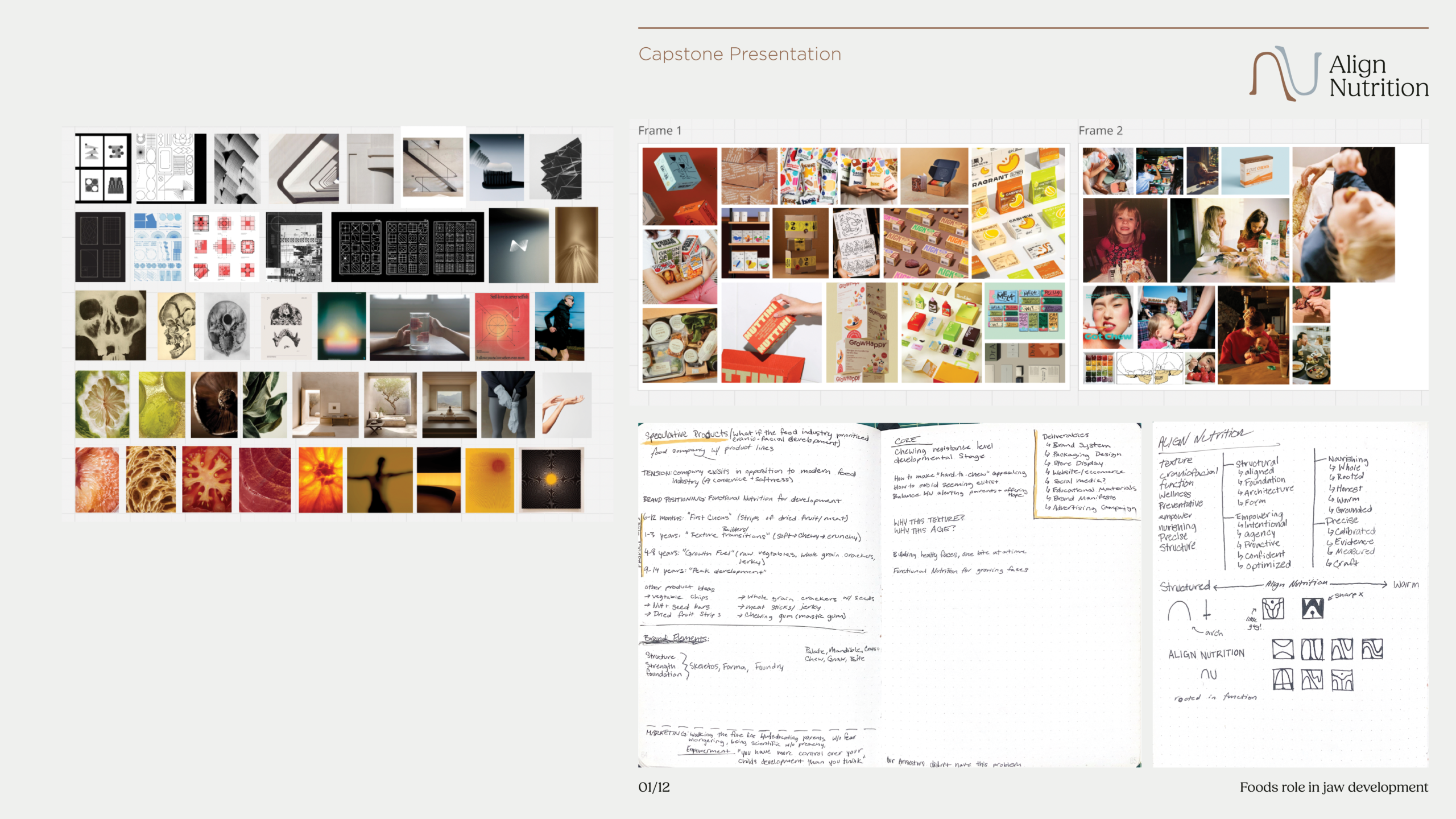
Summarizing my exploratory and investigative research.


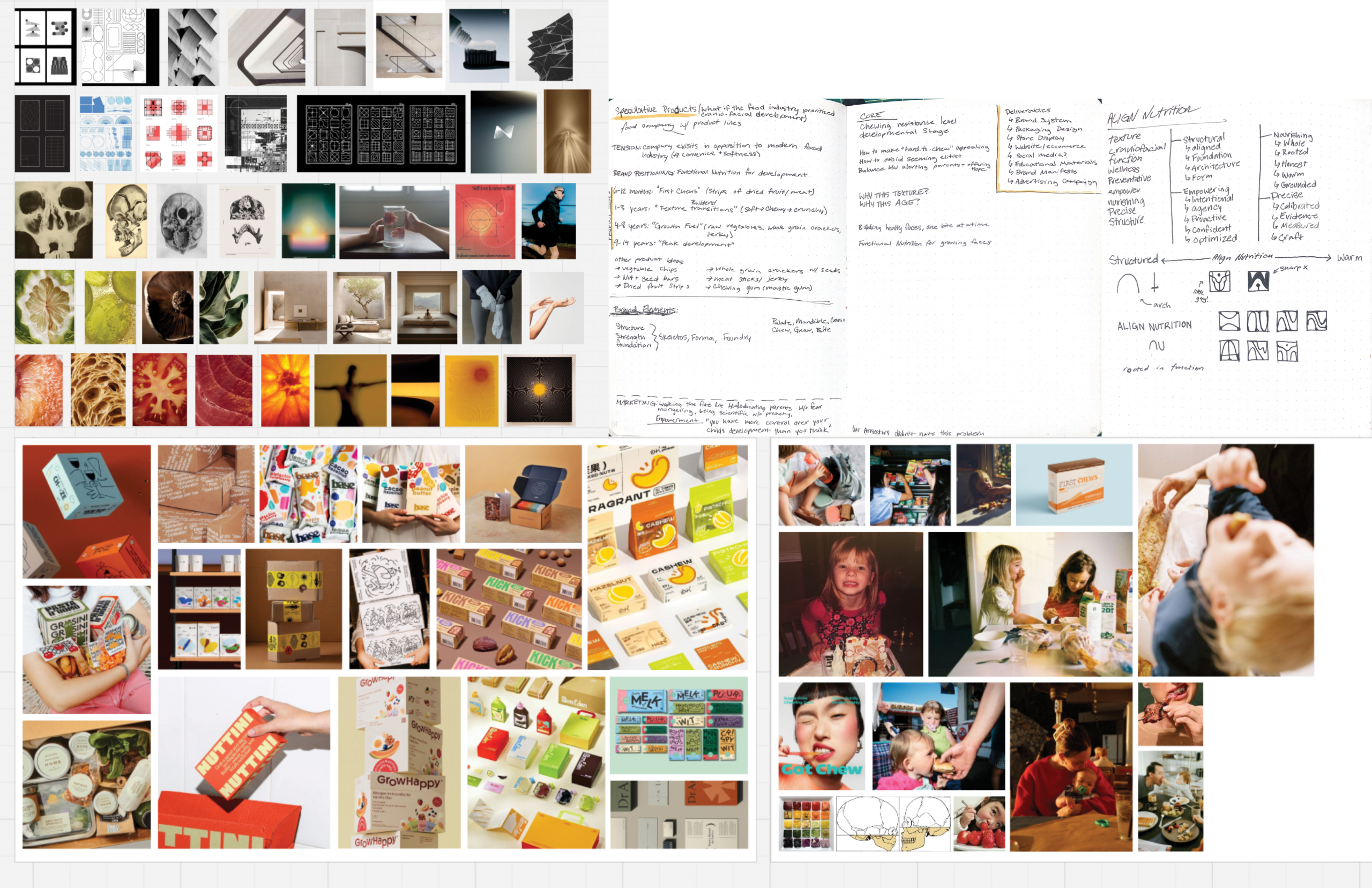
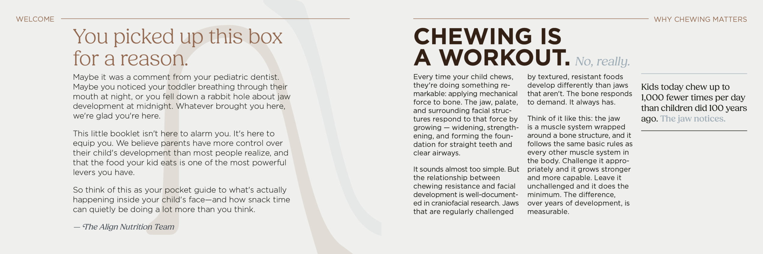
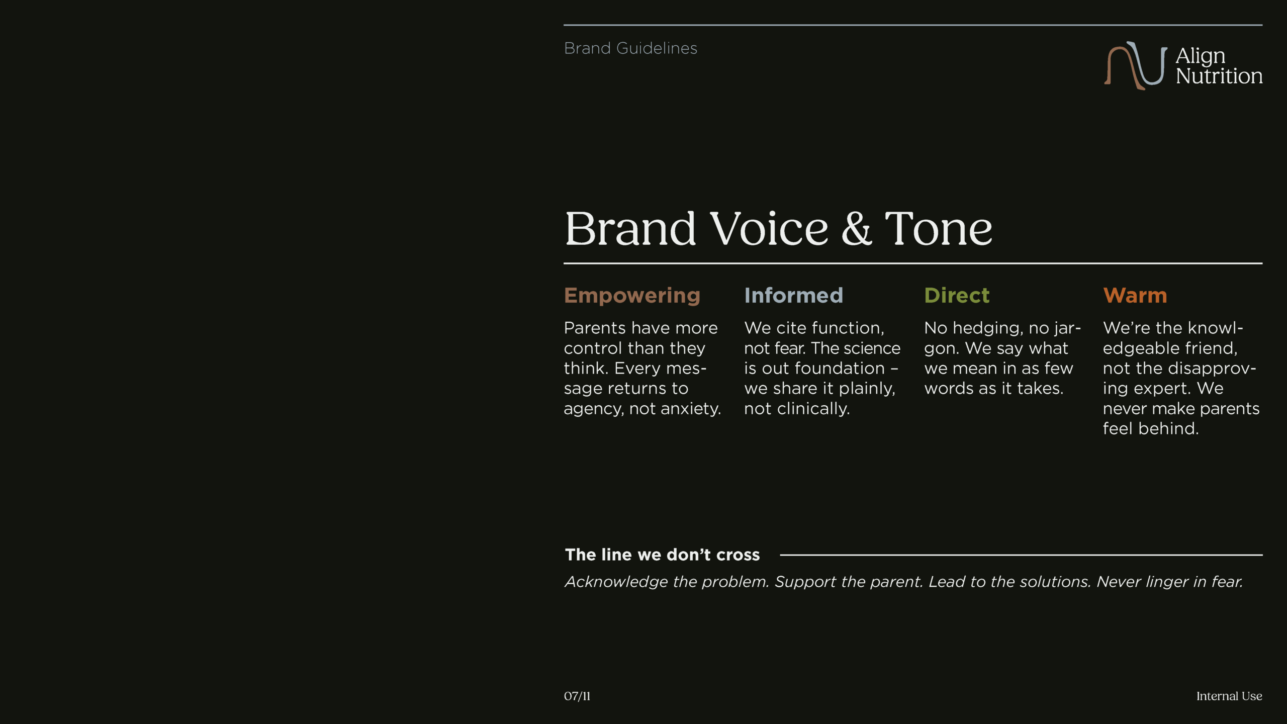
Taking something as clinical as craniofacial development and making it feel like something a parent actually wants to put in their cart: that was the real design problem. The research gave me the what. Brand development was about answering how do you say it, who are you saying it to, and what does it look like when you do.
Align Nutrition emerged from that process. Not as a health brand in the traditional sense, no vitamin callouts, no protein percentages front and center, but as a functional snack brand, one that asks a different question entirely: what does food do for a child’s development beyond feeding them?
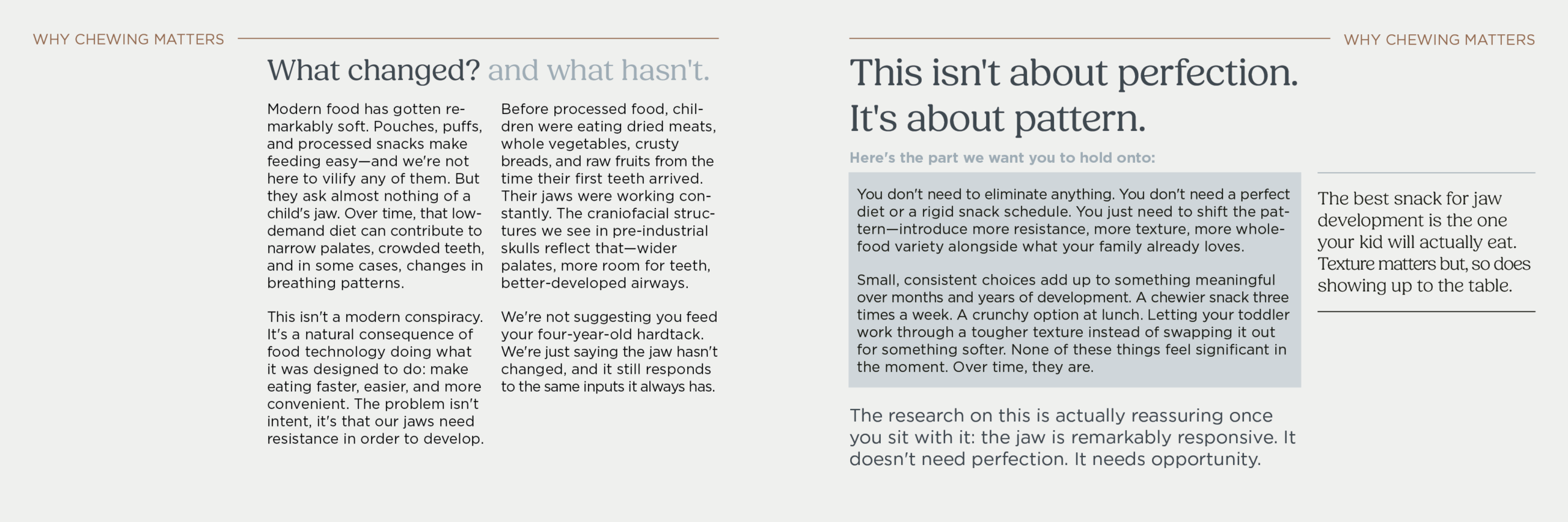
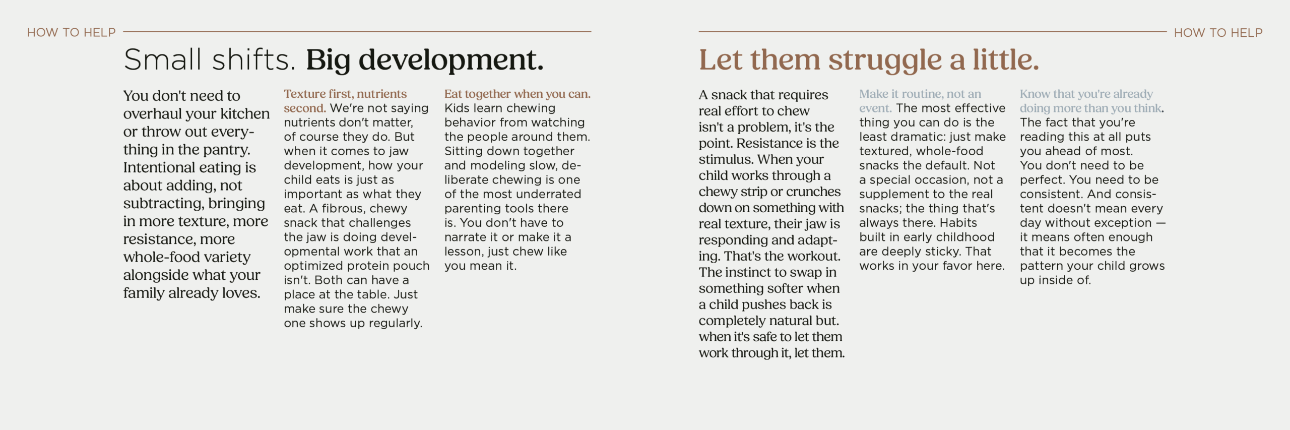
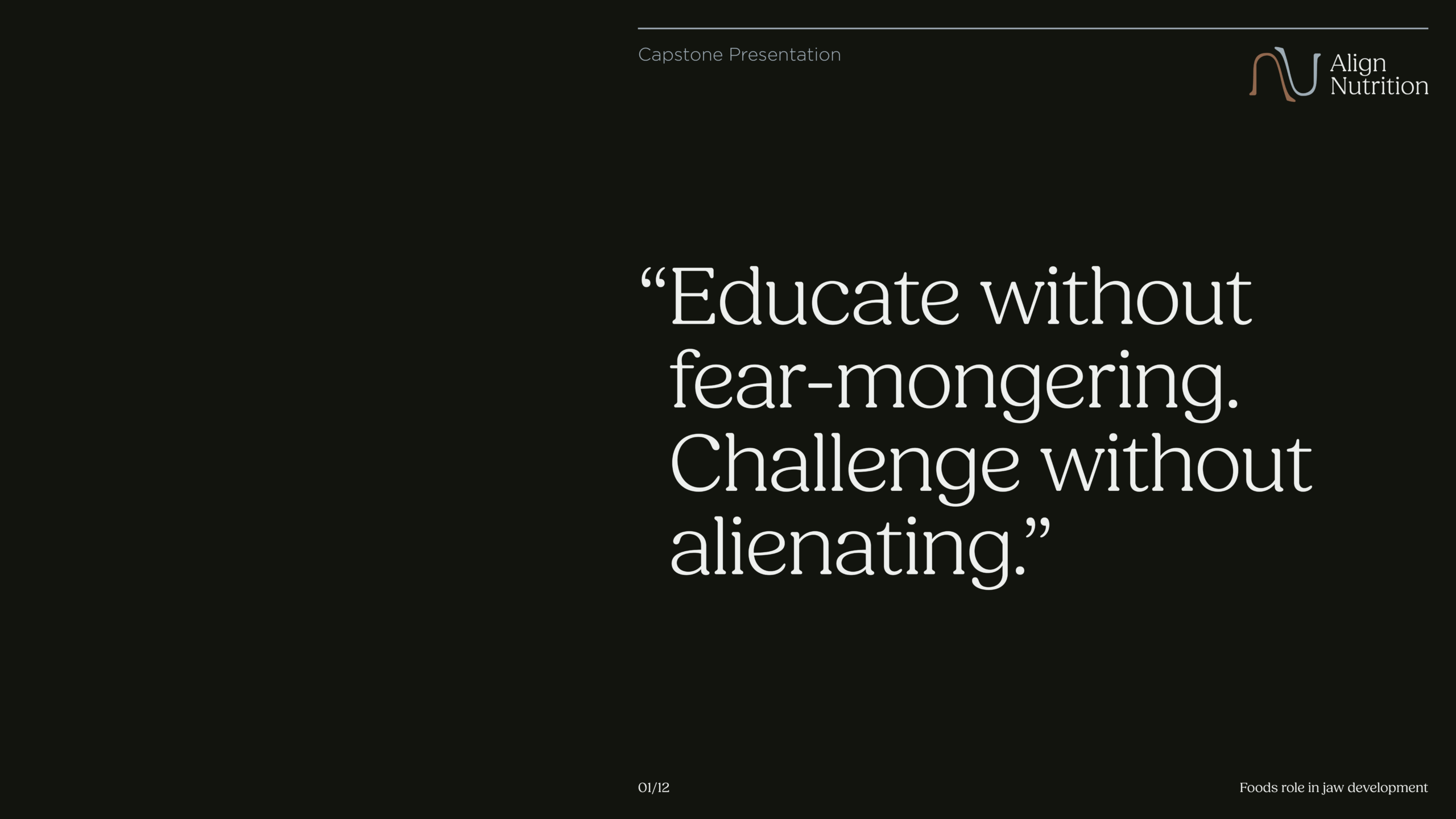
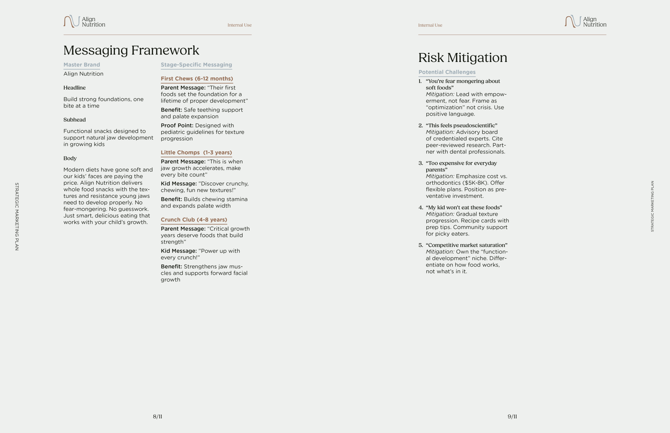
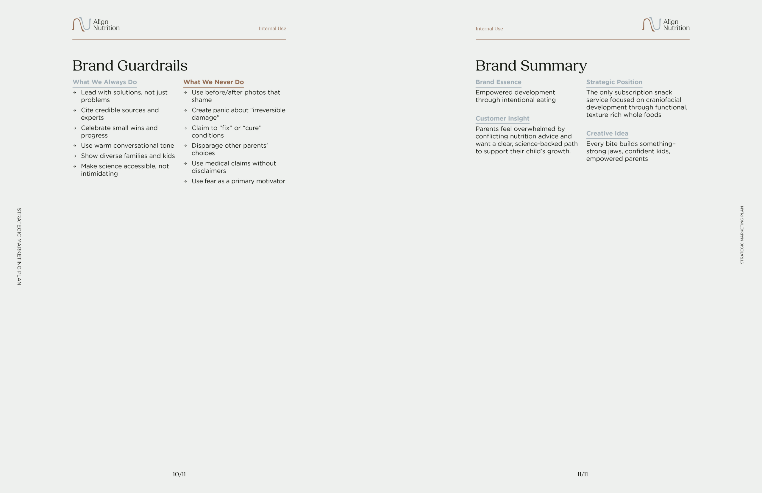
The brand’s central tension was clear from the start. The science behind jaw development and craniofacial health is real, increasingly documented, and increasingly relevant, but it is also easy to get wrong. A brand that leads with fear loses parents. A brand that glosses over the problem loses credibility. The editorial line that governs all of Align’s copy tries to hold that balance: acknowledge the problem, support the parent, lead to the solution, never linger in fear.
From that tension came a positioning the kids’ snack market hasn’t really occupied: function over nutrition. Most competing brands compete on what’s inside: vitamins, low sugar, added protein. Align Nutrition competes on what the act of eating does. Texture. Resistance. Chewing mechanics. That shift in framing opened up everything: the product logic, the sub-brand architecture, the copy tone, the packaging format.
The decision to go subscription-only was also strategic from the start, not logistical. Retail shelving constraints would have compressed the packaging into something generic. Subscription unlocked a more considered unboxing experience: a format that could carry education alongside the product, and that could build the kind of habitual trust the brand’s premise requires.
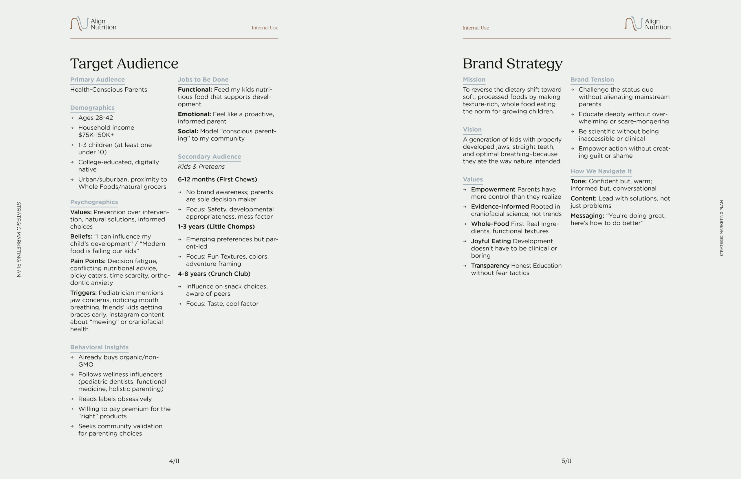
Defining the audience was less about demographics and more about mindset. The primary audience, health-conscious parents with one to three children, falls into the Full Nest I and Full Nest II stages of the household life cycle. These are parents in active, high-demand seasons of life. Their recurring pain points aren’t hard to find: not enough time, too many decisions, picky eaters, and a wellness media landscape that constantly contradicts itself.
What they value is equally consistent: quality they can trust, variety that keeps kids engaged, and solutions that feel thoughtful without requiring a PhD to understand. They are already reaching for better: they just need a brand that meets them there without talking down to them.
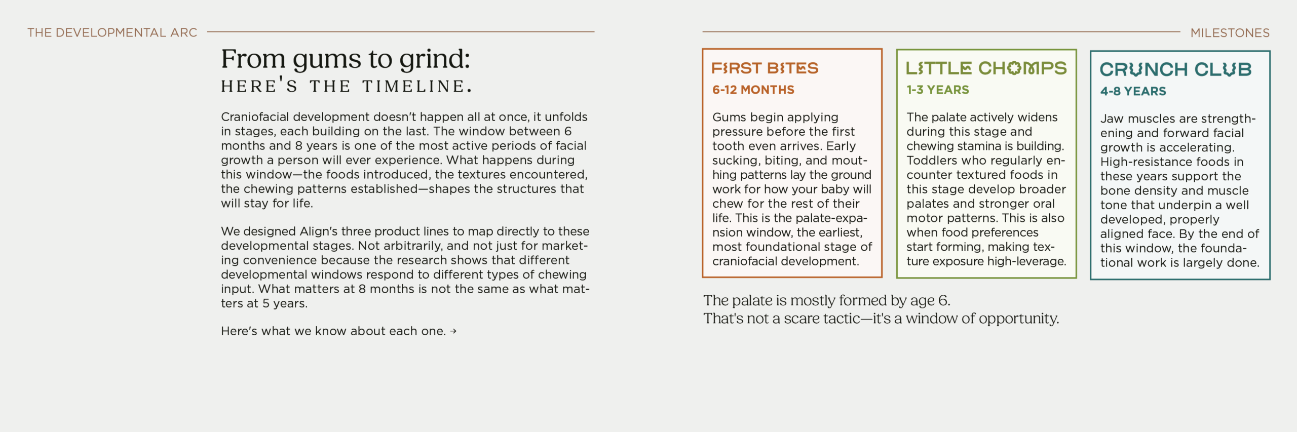
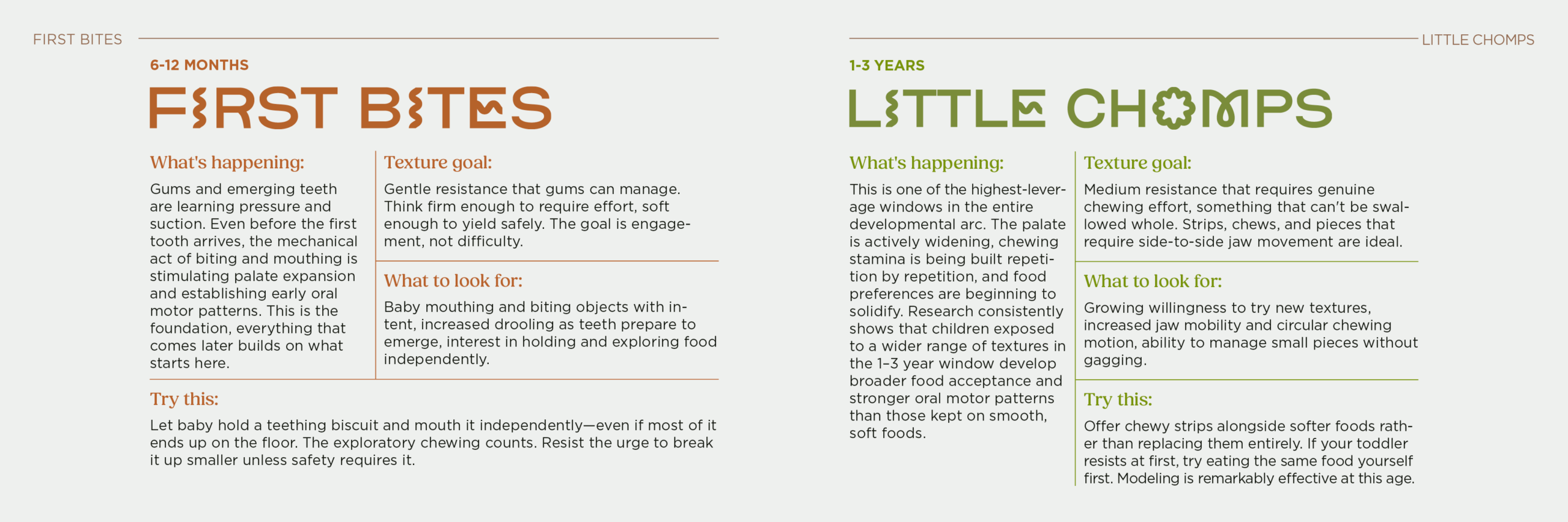
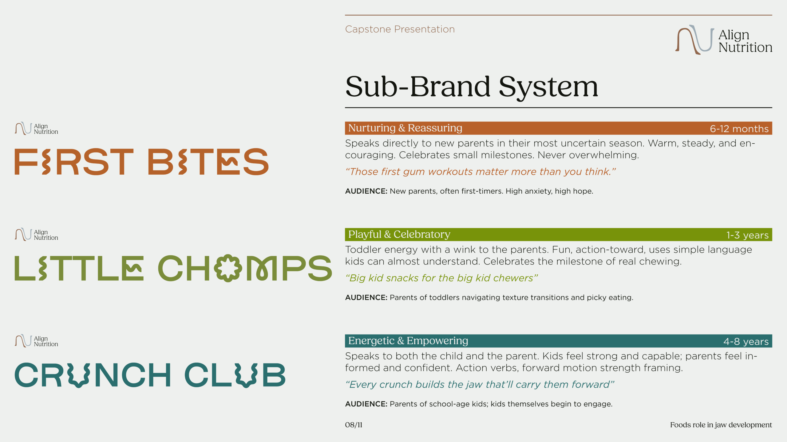
The secondary audience is the children themselves, across three distinct developmental stages from six months to eight years. This shaped the sub-brand architecture more than anything else. A six-month-old and a seven-year-old are not the same customer, and no single product line or visual system should pretend otherwise.

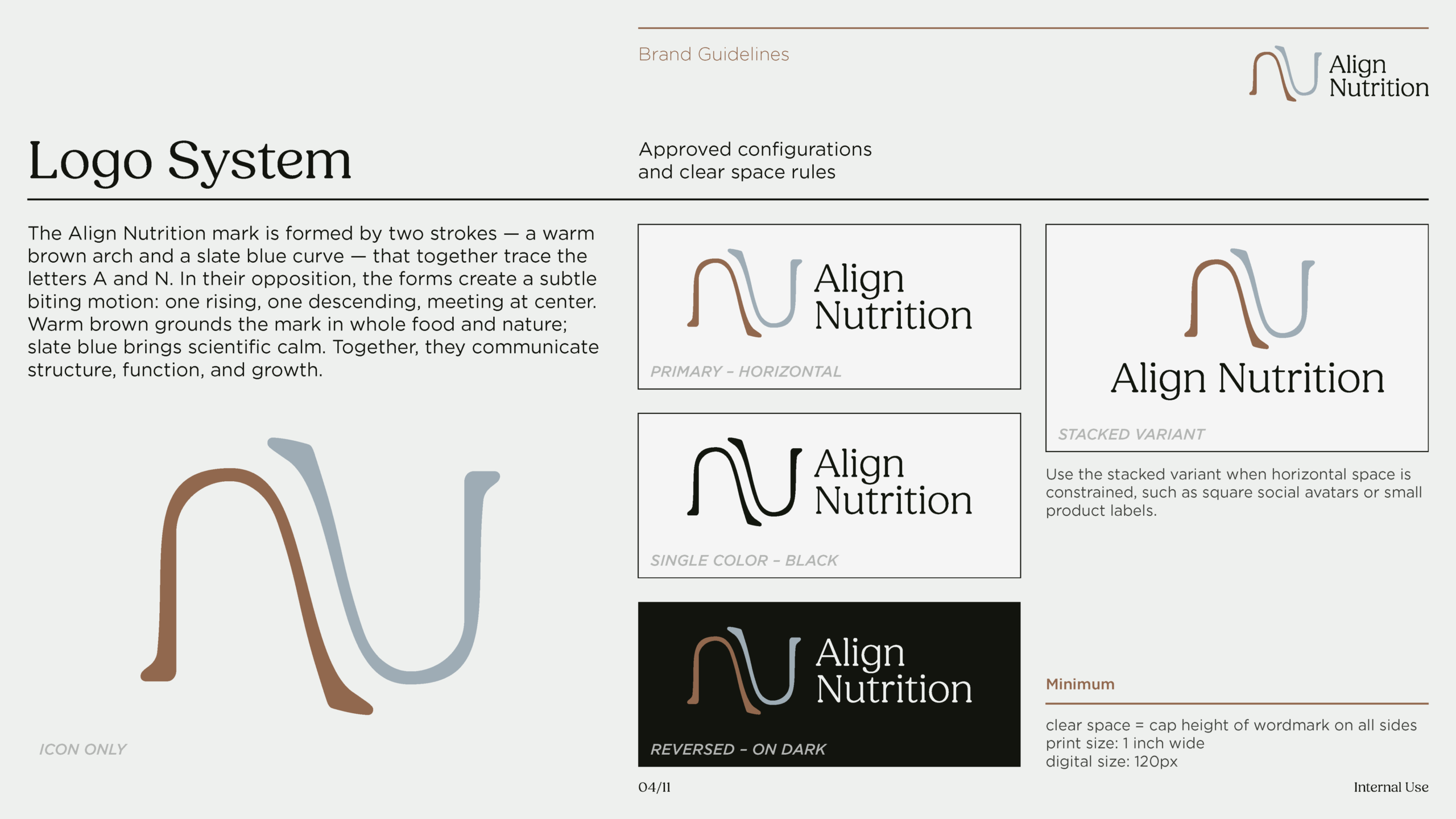
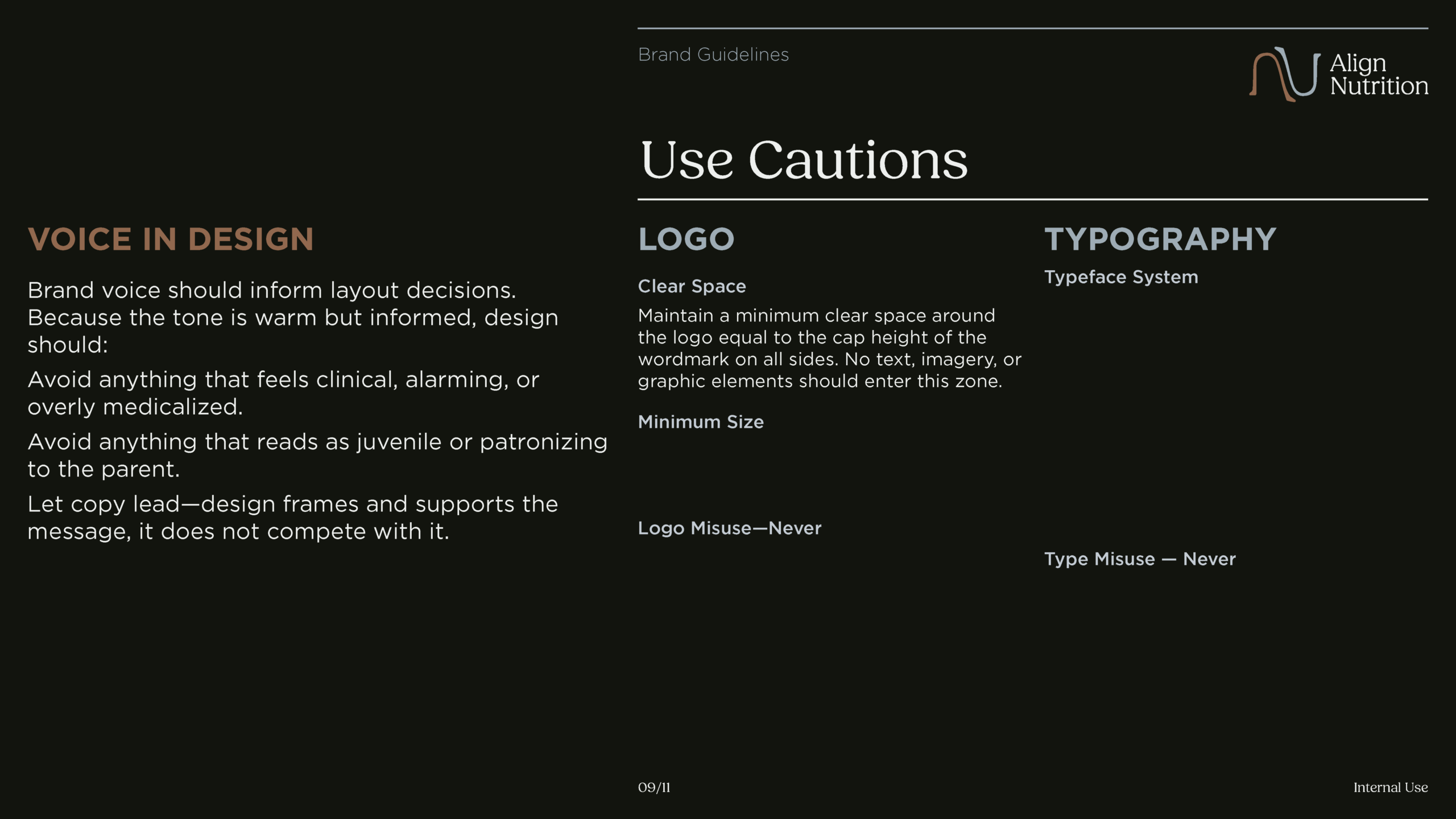
Every decision in the identity system was made to serve the same problem: a brand that needs to feel warm and approachable while carrying real scientific weight.
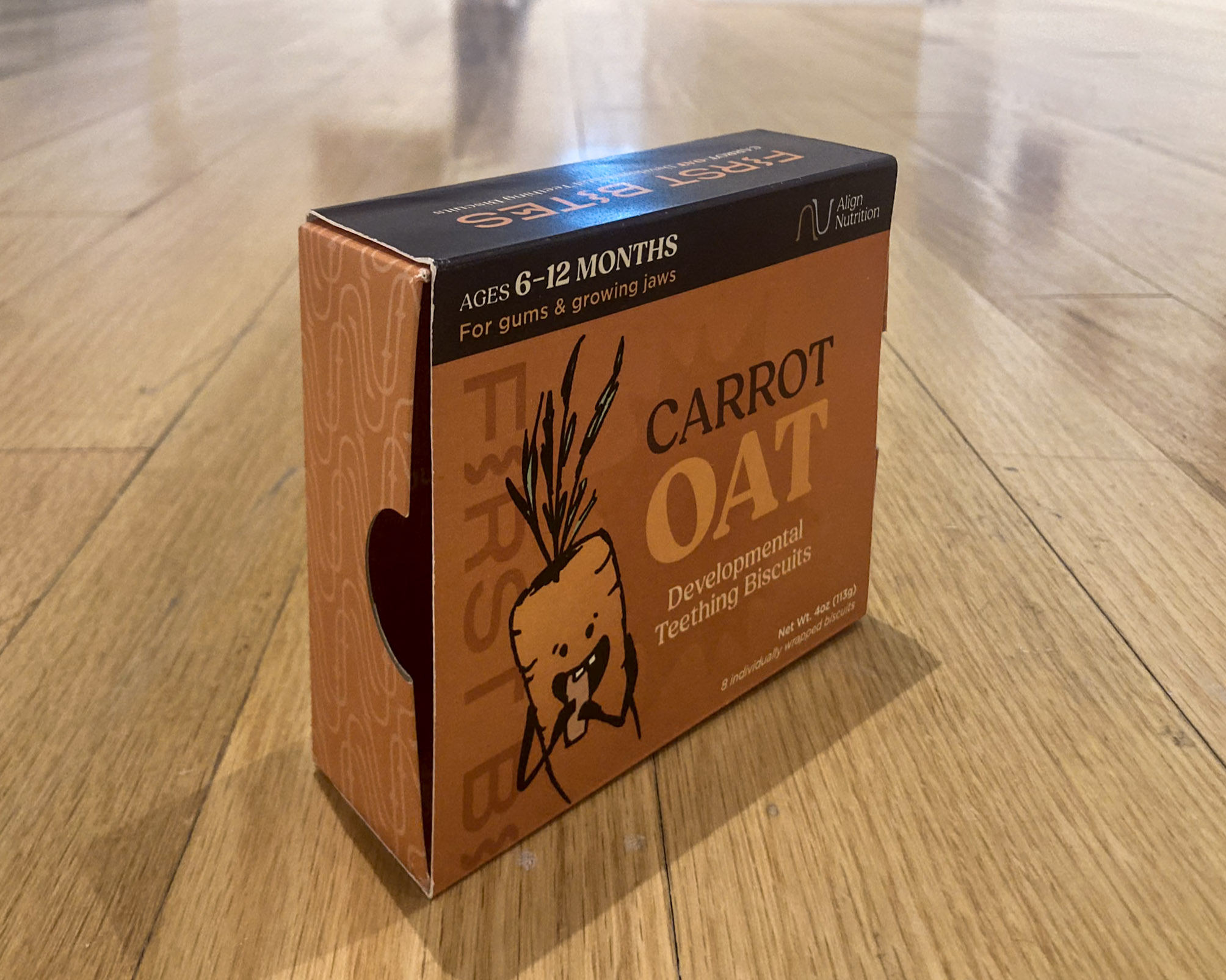
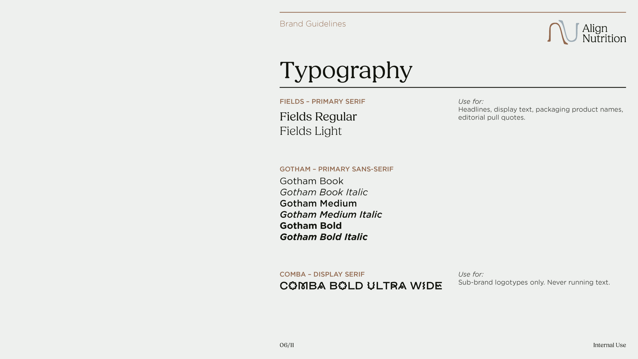
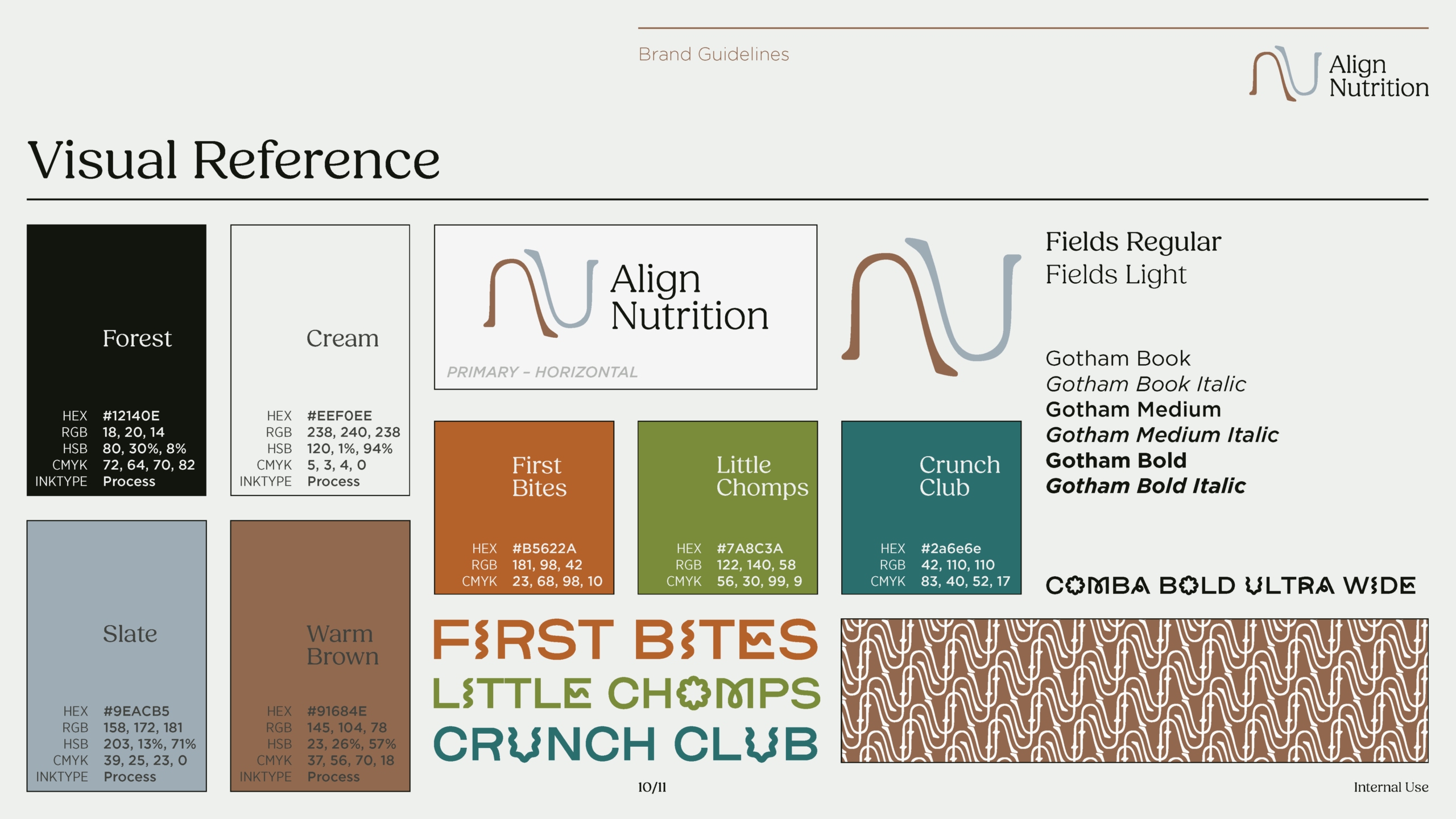
The sub-brand typeface, Comba Bold Ultra Wide, was chosen for a reason that goes beyond aesthetics. Its open vowel forms, particularly the O and the C, read like they are being bitten. The letterform itself expresses the brand’s core function. That isn’t a coincidence or a stretch; it was the deciding factor. Fields Regular is the primary typeface and handles body copy at the editorial level, a humanist serif that softens the scientific content without undercutting it. Gotham handles UI-level text, labels, and structural elements, providing the neutral backbone that lets the other two typefaces do their expressive work.
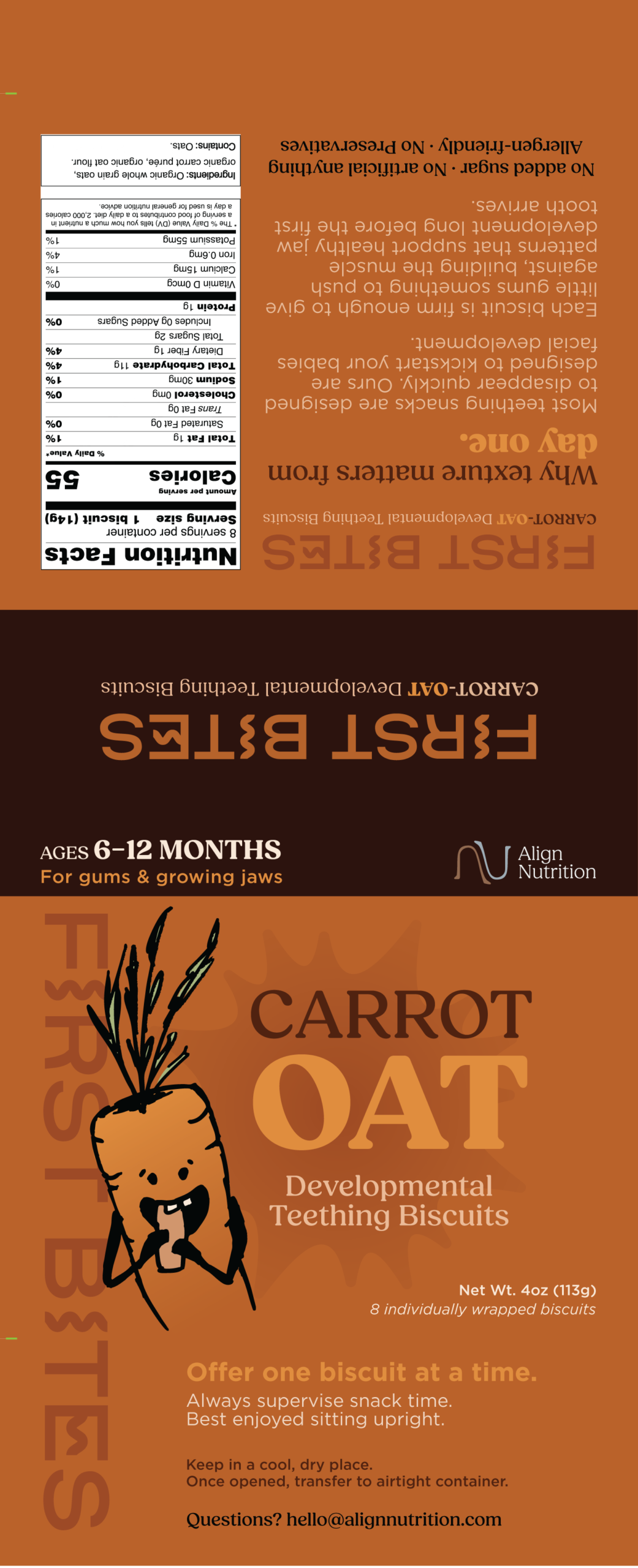
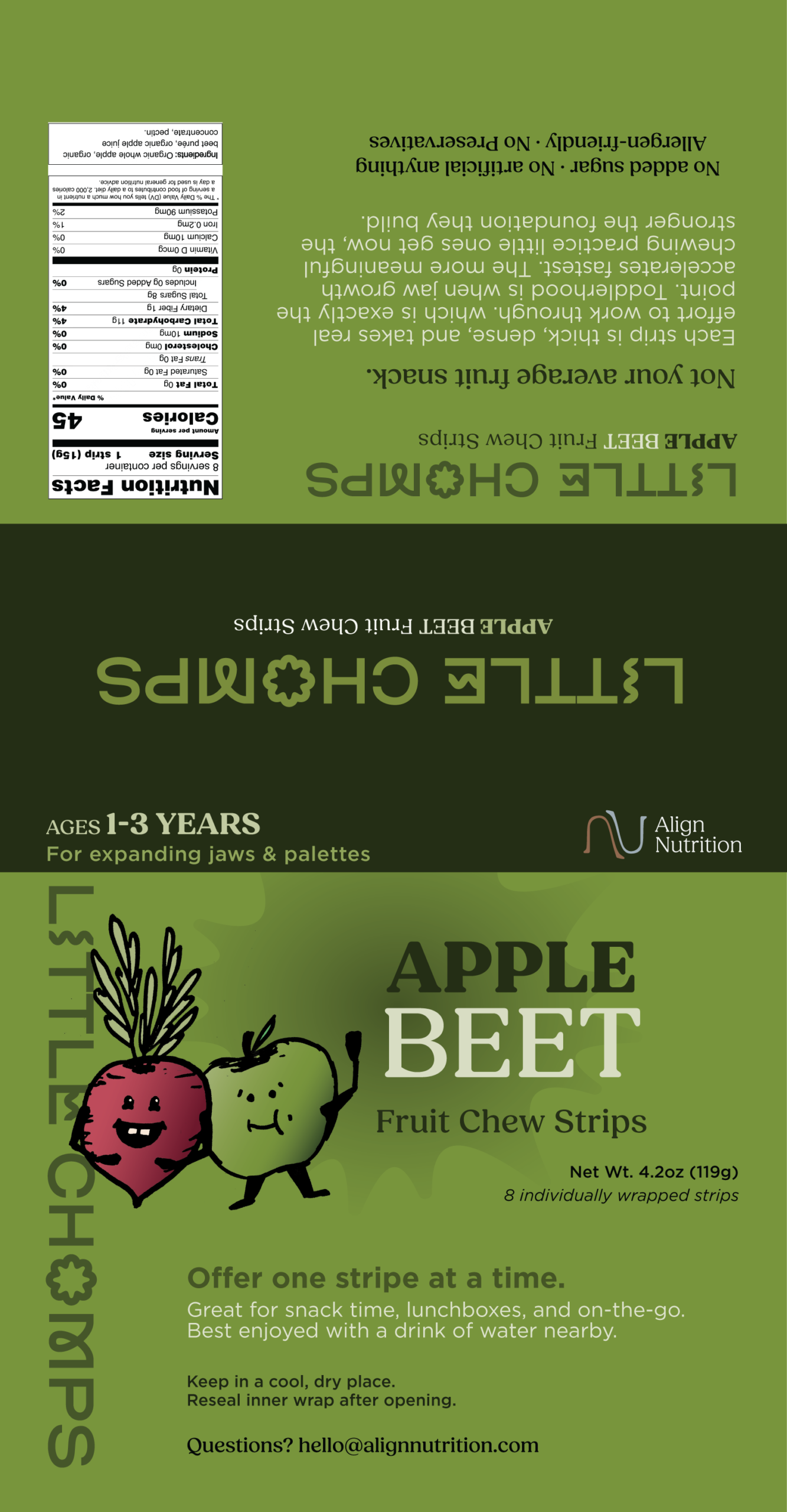
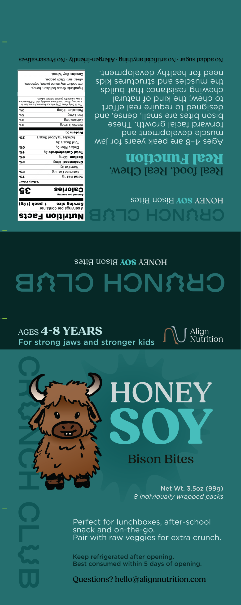
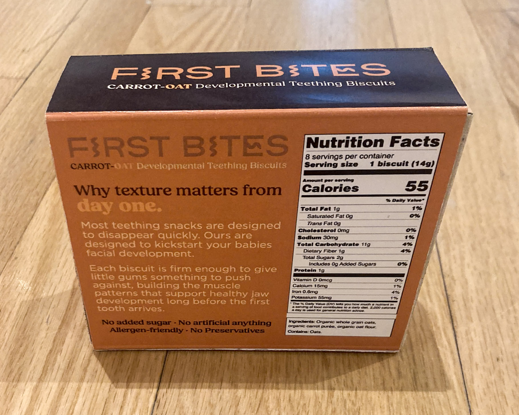
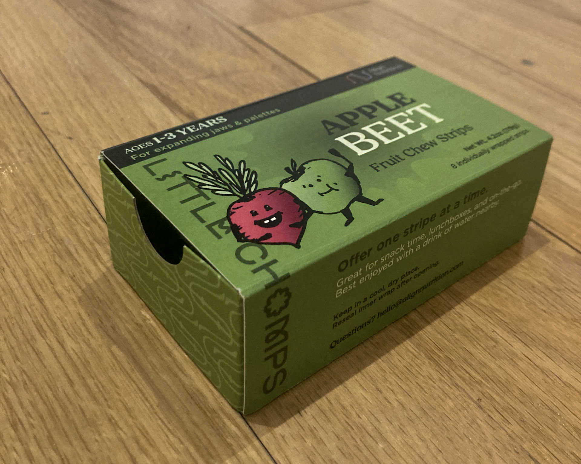
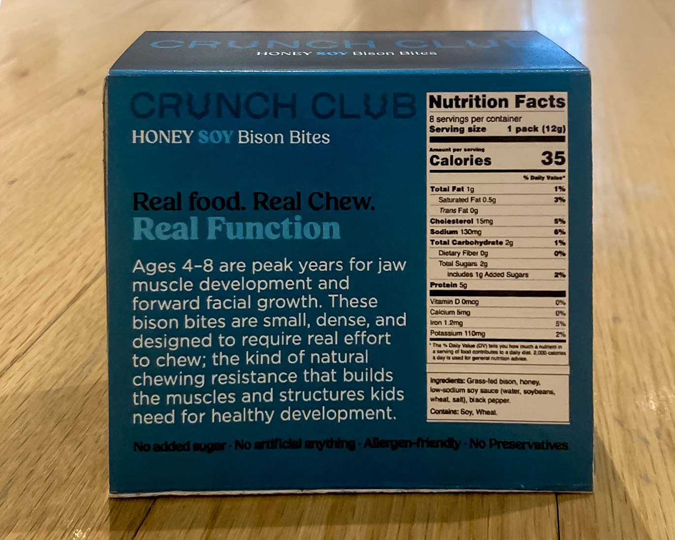
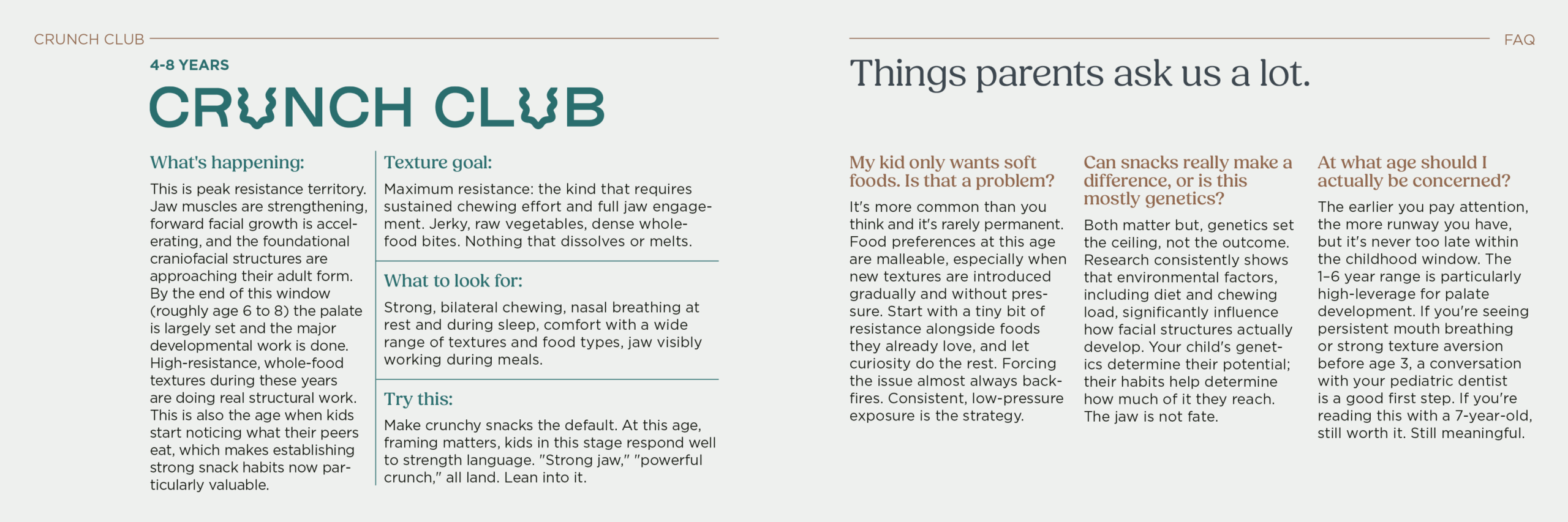
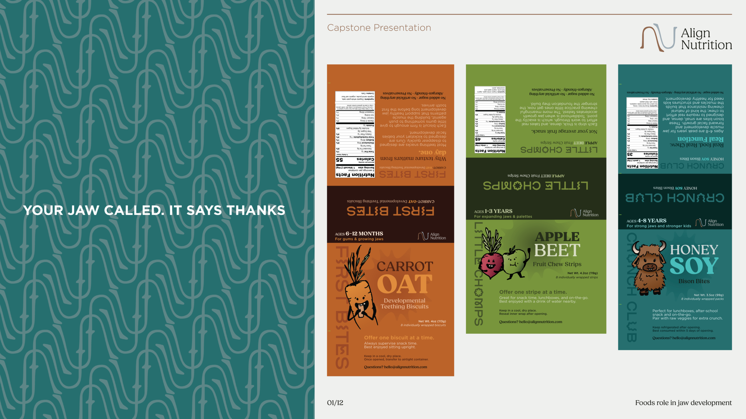
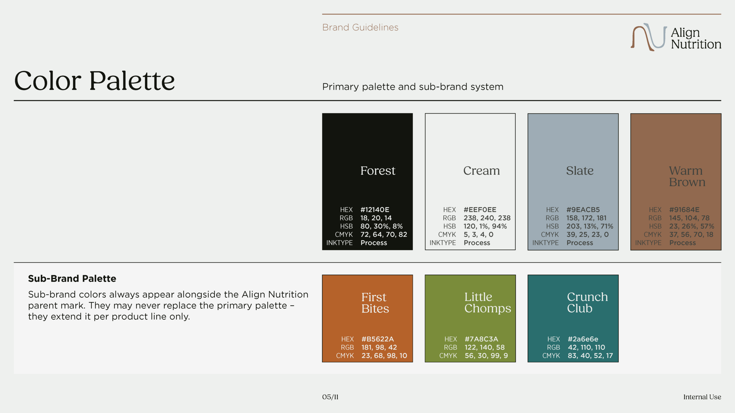
The primary color palette was built around restraint and warmth. Forest anchors the brand in something grounded and serious, this is not a pastel, playful kids’ brand. Cream gives it breath. Slate provides the clinical note without feeling cold. Warm Brown carries the human warmth across copy, accents, and detail work. Each of the three sub-brands then carries its own accent color — orange for First Bites, green for Little Chomps, deep teal for Crunch Club, so that the developmental stages feel visually distinct while remaining clearly part of the same family.
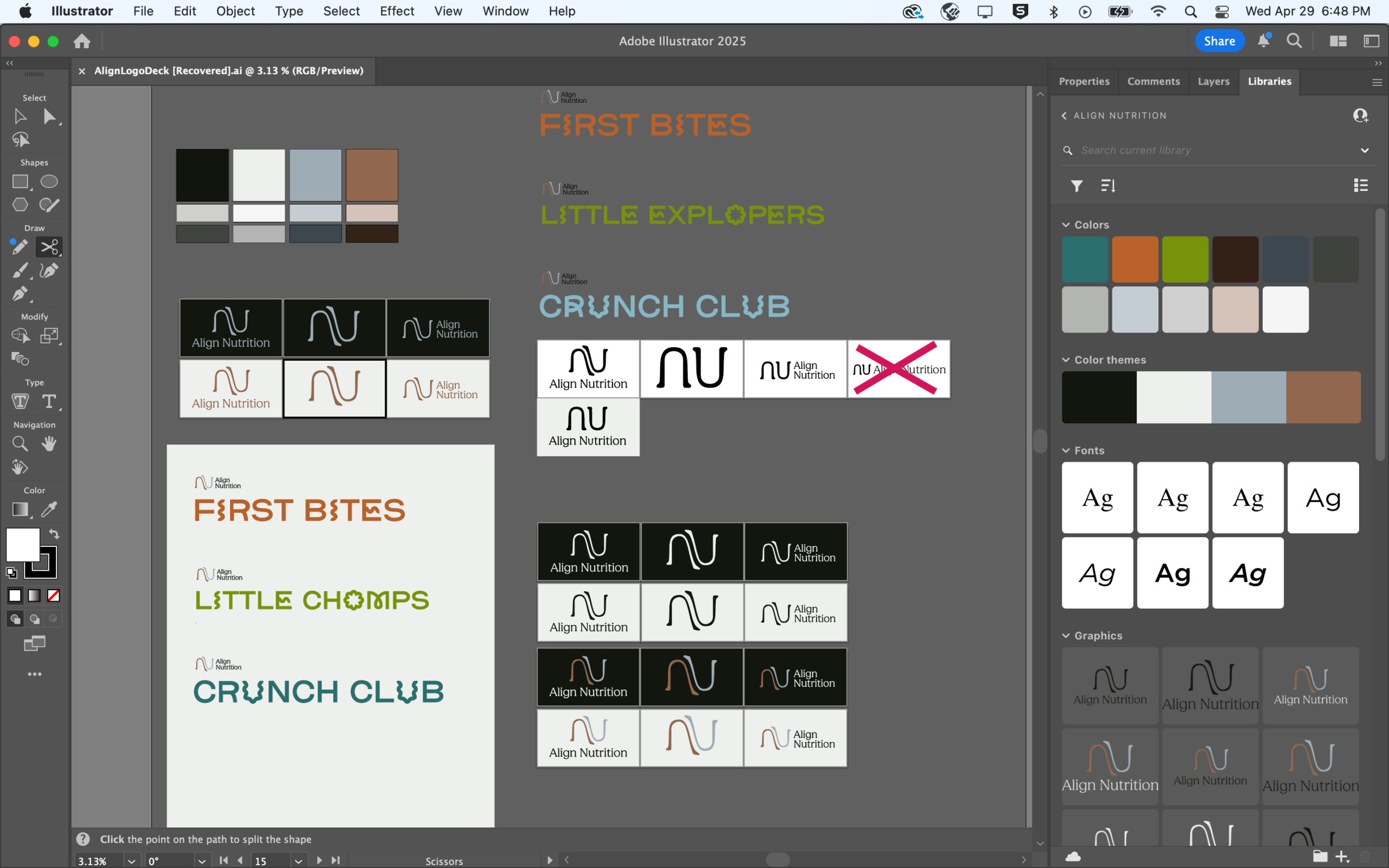
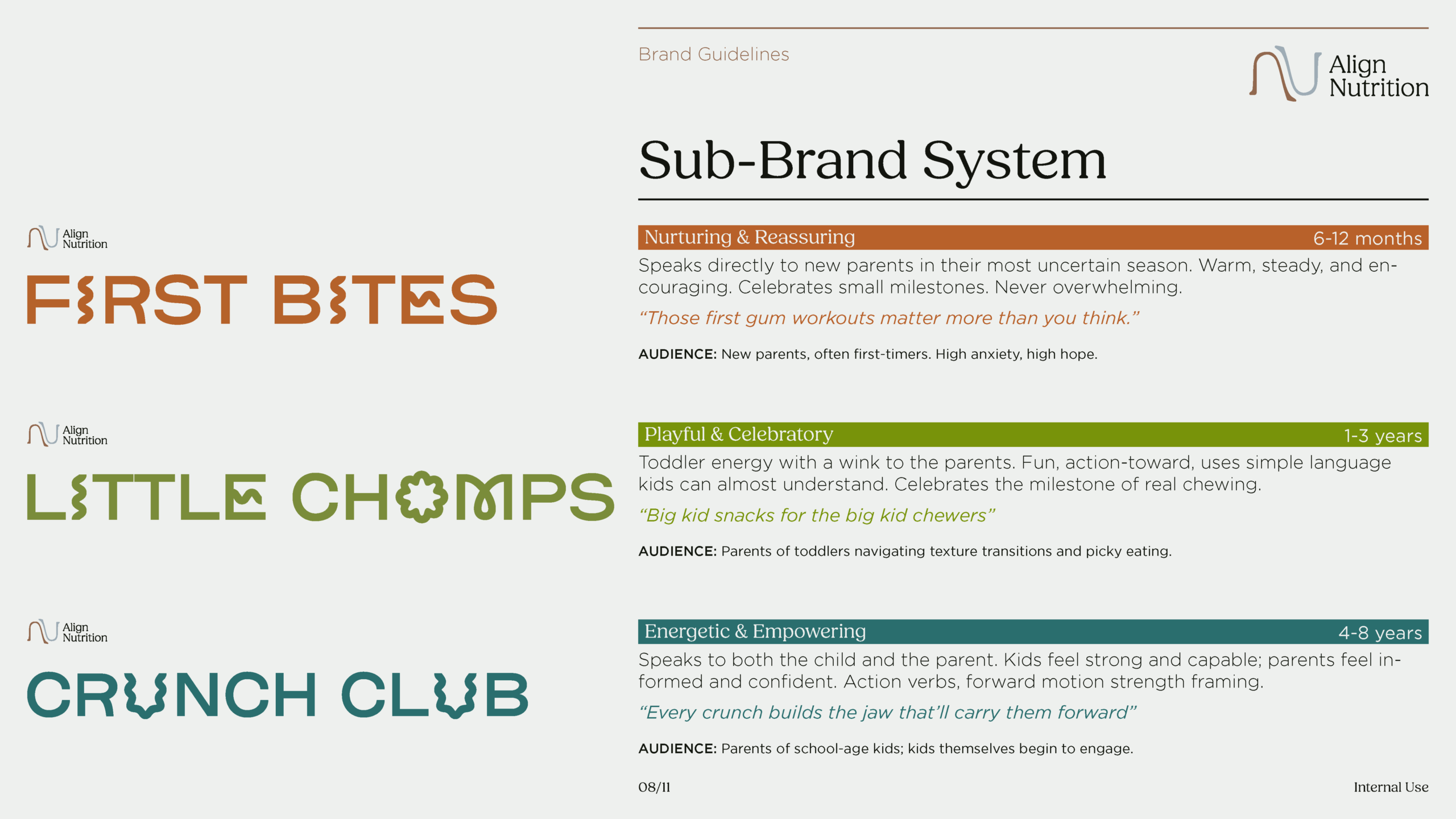

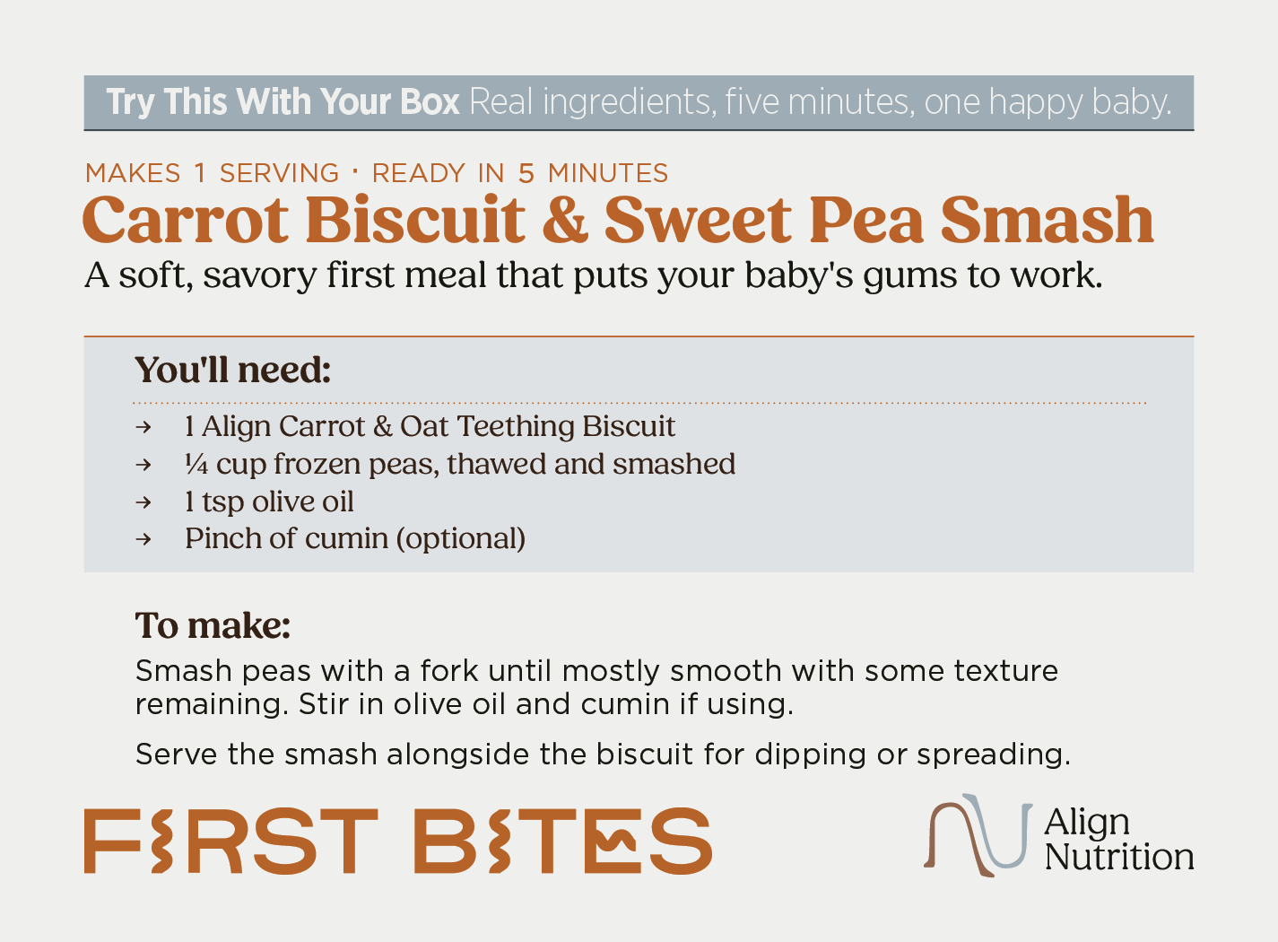
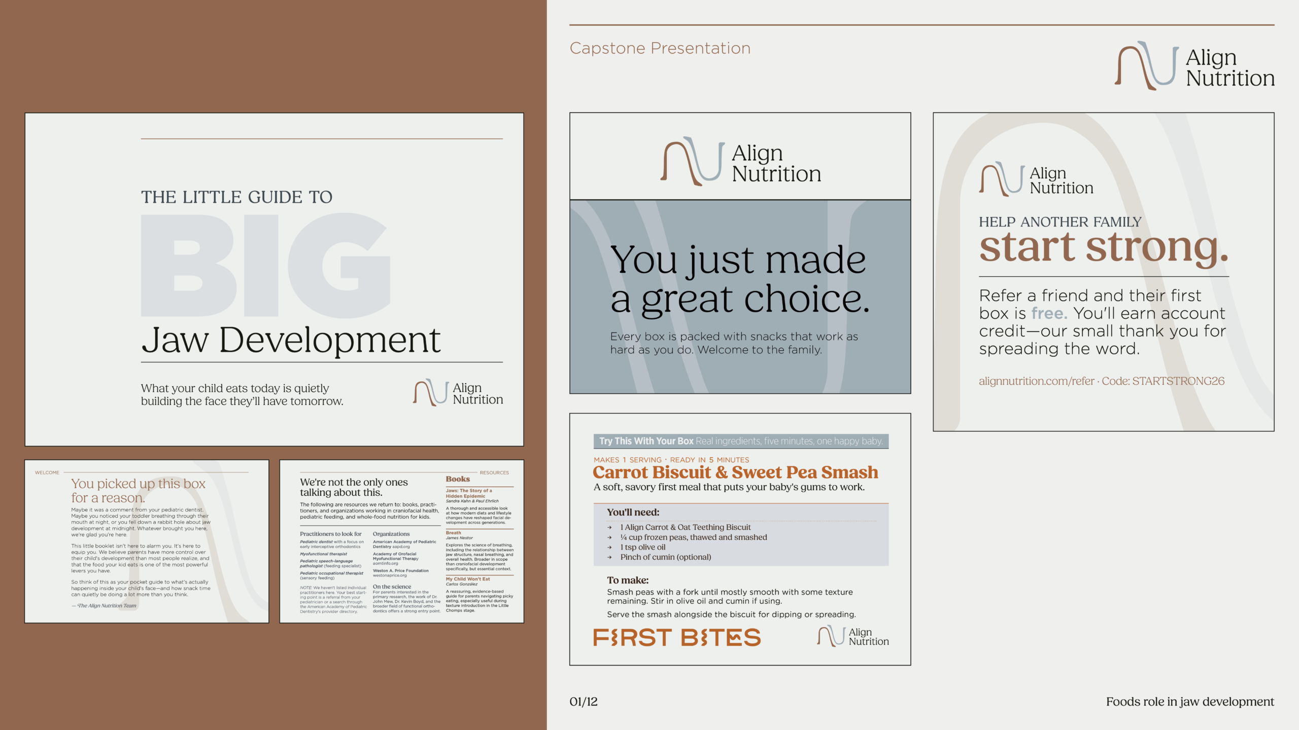
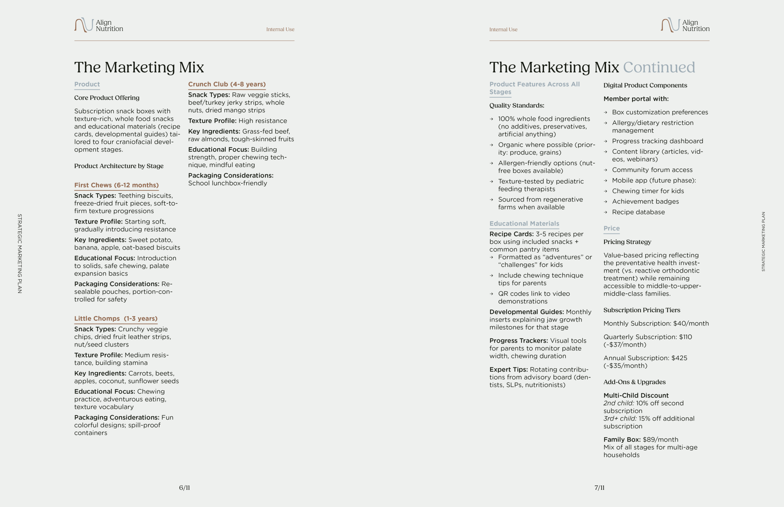
Align Nutrition ships in three product lines, each built around a distinct developmental stage: First Bites for infants six to twelve months, Little Chomps for toddlers one to three years, and Crunch Club for early childhood four to eight years. Each box arrives with more than a snack. A suite of printed collateral sits alongside every order because the product alone can’t carry the brand’s full argument. Parents need context, and the subscription format creates the space to give it to them.
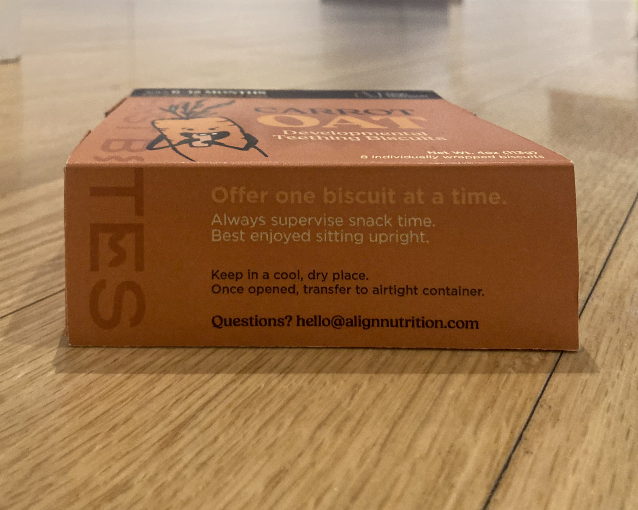
The format decision came early and it shaped everything downstream. Align Nutrition ships in a drawer box, a sleeve and tray construction, across all three sub-brands. The format was only possible because of the subscription model. Retail would have demanded something stackable, standardized, shelf-friendly. Subscription removed those constraints and opened up a packaging format that feels considered and deliberate, something closer to a gift than a grocery run.
Each inner box carries the full sub-brand identity: its name, accent color, product, and developmental stage. The system is consistent enough that all three read as family, and distinct enough that First Bites and Crunch Club never feel like the same product with a different label. The accent colors do a lot of that work, orange, green, and deep teal moving through the developmental arc from infant to early childhood, but so does the copy register, which shifts in energy and directness as the child gets older.
The sleeve exterior carries the brand’s voice. The tray interior carries a surprise, a line of copy printed on the bottom that a parent only finds once the product is fully removed. It’s a small thing, but it rewards the kind of attention the brand is asking parents to bring to feeding their kids.